Pre-program coursework

The goal is to test your software installation, to demonstrate competency in Markdown, and in the basics of ggplot.
Task 1: A Biography About me
Hi there, my name is Hanyu Wang (Hovik). I graduated with a Bachelor of Science degree from The University of Nottingham and am now a student of MAM program at the London Business School. In the past few years, I have had the following practical experience:
- Interned as an Operations Analyst for China’s top 2 Internet companies and Fortune 500 company Tencent;
- Interned as the Product Manager of NetEase, the top 10 Internet company in China;
- Interned as a Strategic Product Manager in the international technology unicorn company DiDi;
- Founded a technology start-up AllLink Ltd. and served as COO.
If you want to know more about me, you can contact me at My LinkedIn; You can also get to know me through this billigual interview from Nottingham University Business School.
Click here to check my photo.
Task 2: gapminder country comparison
Use the glimpse function and have a look at the first 20 rows of data in the gapminder dataset.
glimpse(gapminder)## Rows: 1,704
## Columns: 6
## $ country <fct> "Afghanistan", "Afghanistan", "Afghanistan", "Afghanistan", …
## $ continent <fct> Asia, Asia, Asia, Asia, Asia, Asia, Asia, Asia, Asia, Asia, …
## $ year <int> 1952, 1957, 1962, 1967, 1972, 1977, 1982, 1987, 1992, 1997, …
## $ lifeExp <dbl> 28.801, 30.332, 31.997, 34.020, 36.088, 38.438, 39.854, 40.8…
## $ pop <int> 8425333, 9240934, 10267083, 11537966, 13079460, 14880372, 12…
## $ gdpPercap <dbl> 779.4453, 820.8530, 853.1007, 836.1971, 739.9811, 786.1134, …head(gapminder, 20) # look at the first 20 rows of the dataframe## # A tibble: 20 × 6
## country continent year lifeExp pop gdpPercap
## <fct> <fct> <int> <dbl> <int> <dbl>
## 1 Afghanistan Asia 1952 28.8 8425333 779.
## 2 Afghanistan Asia 1957 30.3 9240934 821.
## 3 Afghanistan Asia 1962 32.0 10267083 853.
## 4 Afghanistan Asia 1967 34.0 11537966 836.
## 5 Afghanistan Asia 1972 36.1 13079460 740.
## 6 Afghanistan Asia 1977 38.4 14880372 786.
## 7 Afghanistan Asia 1982 39.9 12881816 978.
## 8 Afghanistan Asia 1987 40.8 13867957 852.
## 9 Afghanistan Asia 1992 41.7 16317921 649.
## 10 Afghanistan Asia 1997 41.8 22227415 635.
## 11 Afghanistan Asia 2002 42.1 25268405 727.
## 12 Afghanistan Asia 2007 43.8 31889923 975.
## 13 Albania Europe 1952 55.2 1282697 1601.
## 14 Albania Europe 1957 59.3 1476505 1942.
## 15 Albania Europe 1962 64.8 1728137 2313.
## 16 Albania Europe 1967 66.2 1984060 2760.
## 17 Albania Europe 1972 67.7 2263554 3313.
## 18 Albania Europe 1977 68.9 2509048 3533.
## 19 Albania Europe 1982 70.4 2780097 3631.
## 20 Albania Europe 1987 72 3075321 3739.Create the country_data and continent_data with the code below.
country_data <- gapminder %>%
            filter(country == "China")

continent_data <- gapminder %>%
            filter(continent == "Asia")
First, create a plot of life expectancy over time for China. Map year on the x-axis, and lifeExp on the y-axis. Use geom_point() to see the actual data points and geom_smooth(se = FALSE) to plot the underlying trendlines.
plot1 <- ggplot(data = country_data, mapping = aes(x = year, y = lifeExp))+
   geom_point() +
   geom_smooth(se = FALSE) +
   NULL

plot1
## `geom_smooth()` using method = 'loess' and formula 'y ~ x'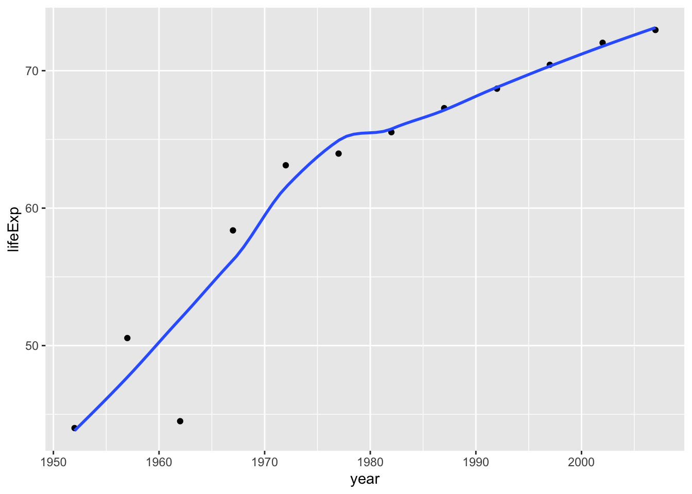
Next, Add a title. Create a new plot, or extend plot1, using the labs() function to add an informative title to the plot.
plot1<- plot1 +
  labs(title = "Trends in China's life expectancy from 1950s",
      x = "Year",
      y = "Life expenctancy") +
      NULL

plot1
## `geom_smooth()` using method = 'loess' and formula 'y ~ x'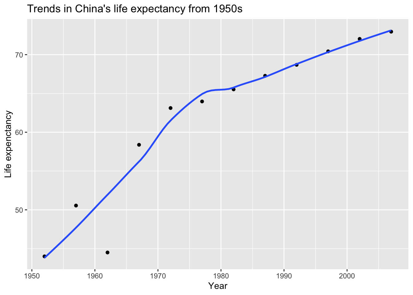
Secondly, produce a plot for all countries in the Asia.
ggplot(continent_data, mapping = aes(x = year, y = lifeExp , colour= country, group = country))+
  geom_point() +
  geom_smooth(se = FALSE) +
  NULL
## `geom_smooth()` using method = 'loess' and formula 'y ~ x'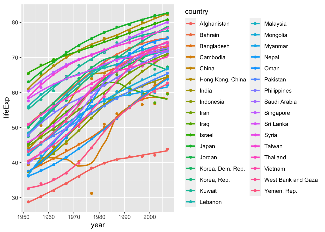
Finally, using the original gapminder data, produce a life expectancy over time graph, grouped (or faceted) by continent. Remove all legends, adding the theme(legend.position="none") in the end of our ggplot.
ggplot(data = gapminder , mapping = aes(x = year , y = lifeExp , colour= continent))+
  geom_point() +
  geom_smooth(se = FALSE) +
  facet_wrap(~continent) +
  theme(legend.position="none") +
  NULL
## `geom_smooth()` using method = 'loess' and formula 'y ~ x'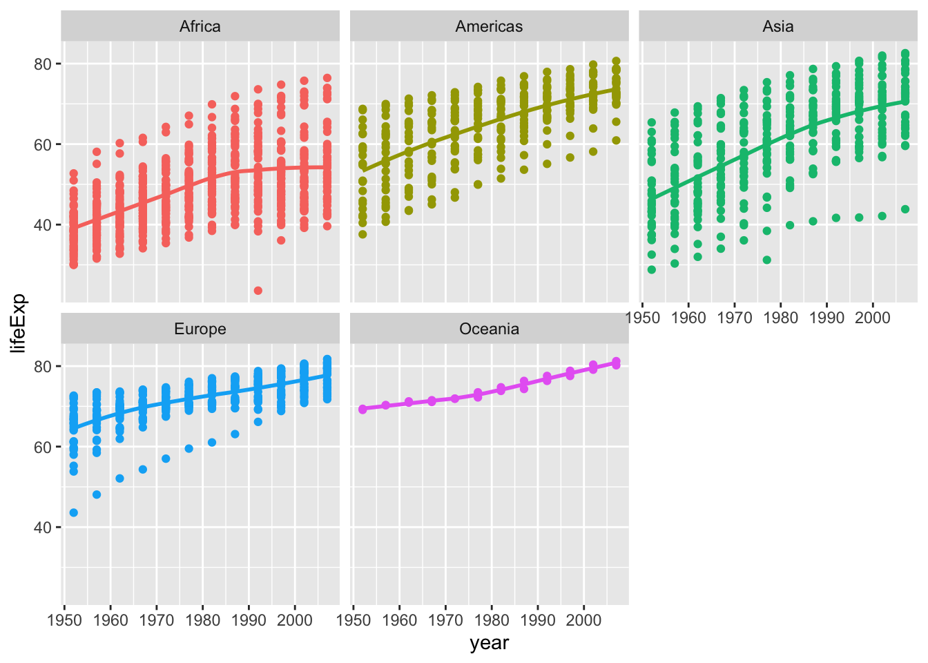
Brief conclusions about life expectancy
From the above graphs, we can draw some conclusions about life expectancy:
- As far as China is concerned, life expectancy has continued to increase since 1952 and nearly doubled in 50 years. Economic development and medical technology improvement can Considered as a potential cause;
- As far as Asia is concerned, almost all Asian countries have had a significant increase in life expectancy due to economic development since 1952, and life expectancy in only a few countries fluctuated between 1970 and 1980;
- When observing at life expectancy from the continental dimension in the world, due to the slowdown in economic development, life expectancy in Europe and Oceania has stabilized and slightly increased; in Asia and the Americas, which are still developing rapidly, life expectancy has increased significantly; in Africa, where economic and medical standards are stagnant, there has even been a downward trend of life expectancy in recent decades.
Task 3: Brexit vote analysis
First we read the data using read_csv() and have a quick glimpse at the data
brexit_results <- read_csv(here::here("~/Desktop/MAM assessment/fold/my_website","brexit_results.csv"))

glimpse(brexit_results)
## Rows: 632
## Columns: 11
## $ Seat <chr> "Aldershot", "Aldridge-Brownhills", "Altrincham and Sale W…
## $ con_2015 <dbl> 50.592, 52.050, 52.994, 43.979, 60.788, 22.418, 52.454, 22…
## $ lab_2015 <dbl> 18.333, 22.369, 26.686, 34.781, 11.197, 41.022, 18.441, 49…
## $ ld_2015 <dbl> 8.824, 3.367, 8.383, 2.975, 7.192, 14.828, 5.984, 2.423, 1…
## $ ukip_2015 <dbl> 17.867, 19.624, 8.011, 15.887, 14.438, 21.409, 18.821, 21.…
## $ leave_share <dbl> 57.89777, 67.79635, 38.58780, 65.29912, 49.70111, 70.47289…
## $ born_in_uk <dbl> 83.10464, 96.12207, 90.48566, 97.30437, 93.33793, 96.96214…
## $ male <dbl> 49.89896, 48.92951, 48.90621, 49.21657, 48.00189, 49.17185…
## $ unemployed <dbl> 3.637000, 4.553607, 3.039963, 4.261173, 2.468100, 4.742731…
## $ degree <dbl> 13.870661, 9.974114, 28.600135, 9.336294, 18.775591, 6.085…
## $ age_18to24 <dbl> 9.406093, 7.325850, 6.437453, 7.747801, 5.734730, 8.209863…To get a sense of the spread, or distribution, of the data, Plot a histogram, a density plot, and the empirical cumulative distribution function of the leave % in all constituencies.
# histogram
ggplot(brexit_results, aes(x = leave_share)) +
  geom_histogram(binwidth = 2.5) +
  labs(title = "Histogram of Brexit preference rate distribution",
    x = "preference rate for Brexit",
    y = "Count")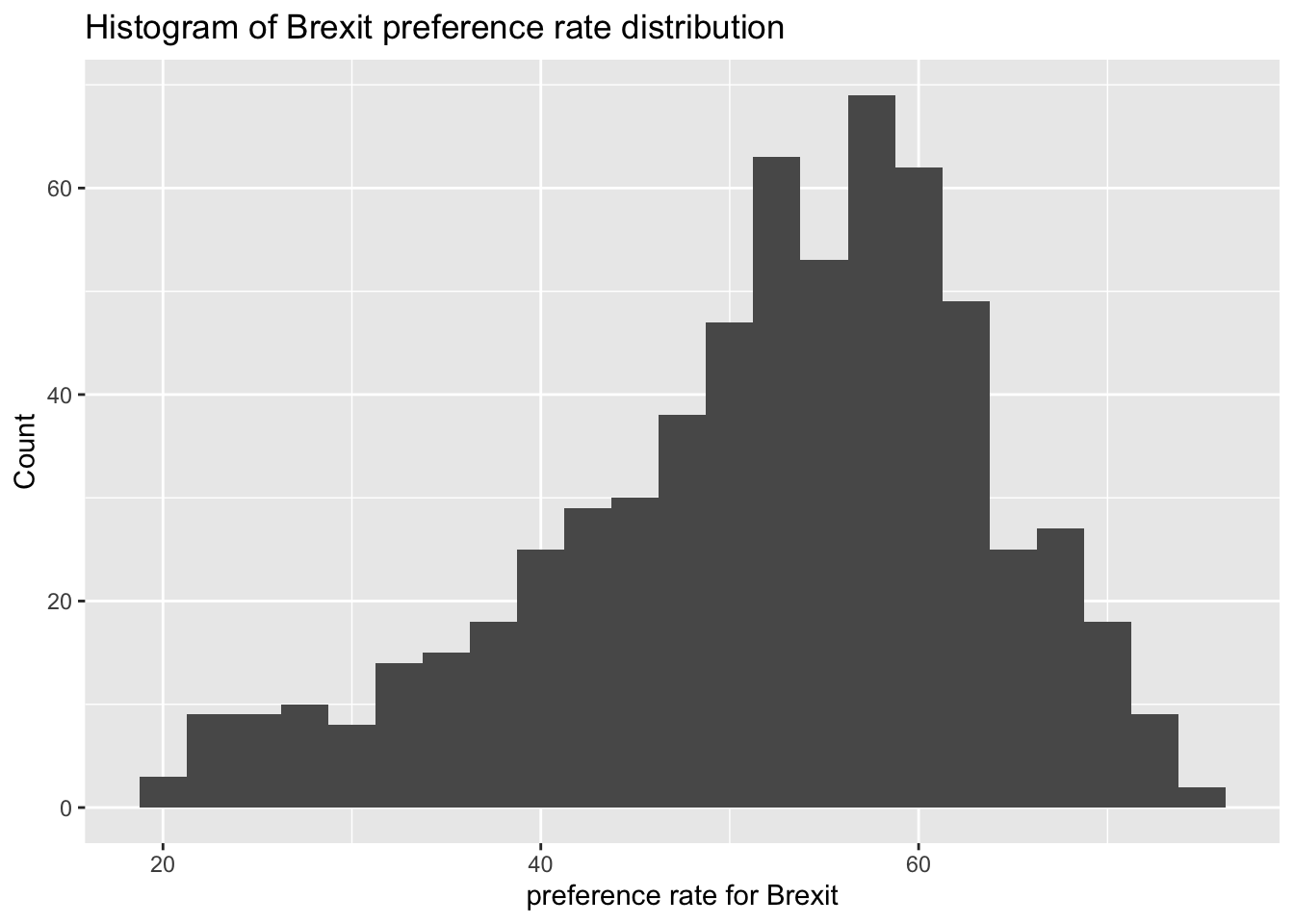
# density plot-- think smoothed histogram
ggplot(brexit_results, aes(x = leave_share)) +
  geom_density() +
  labs(title = "Density plot of Brexit preference rate distribution",
    x = "preference rate for Brexit",
    y = "Density")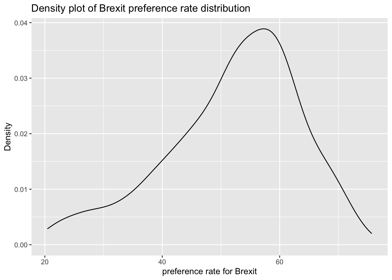
# The empirical cumulative distribution function (ECDF)
ggplot(brexit_results, aes(x = leave_share)) +
  stat_ecdf(geom = "step", pad = FALSE) +
  scale_y_continuous(labels = scales::percent) +
  labs(title = "Empirical cumulative distribution of Brexit preference rate",
    x = "preference rate for Brexit",
    y = "Cumulative distribution")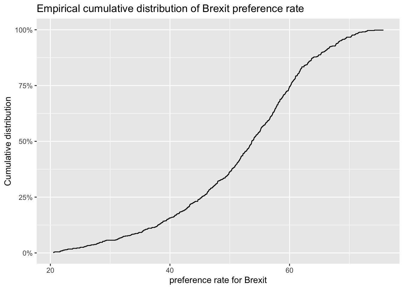
One common explanation for the Brexit outcome was fear of immigration and opposition to the EU’s more open border policy. We can check the relationship (or correlation) between the proportion of native born residents (born_in_uk) in a constituency and its leave_share. To do this, get the correlation between the two variables
brexit_results %>%
  select(leave_share, born_in_uk) %>%
  cor()
## leave_share born_in_uk
## leave_share 1.0000000 0.4934295
## born_in_uk 0.4934295 1.0000000The correlation is almost 0.5, which shows that the two variables are positively correlated.
Create a scatterplot between these two variables using geom_point. We also add the best fit line, using geom_smooth(method = "lm").
ggplot(brexit_results, aes(x = born_in_uk, y = leave_share)) +
  geom_point(alpha=0.3) +
  geom_smooth(method = "lm") +
  theme_bw() +
  labs(title = "The relationship between proportion of native born residents and Brexit preference rate",
    x = "Proportion of native born residents",
    y = "Brexit preference rate") +
    NULL
## `geom_smooth()` using formula 'y ~ x'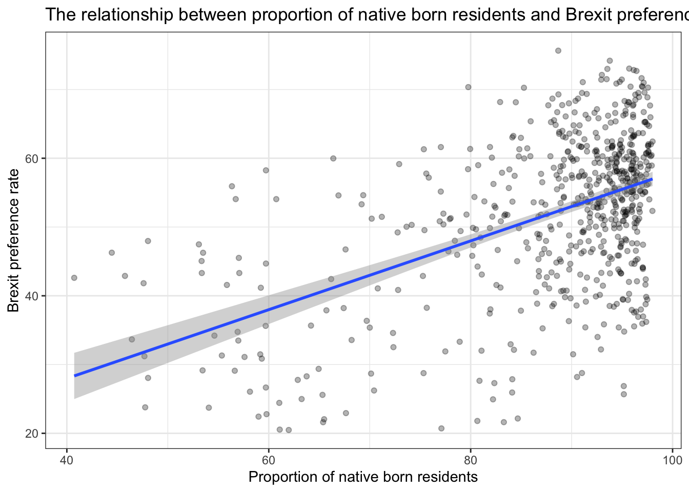
Brief conclusions about Brexit vote analysis
According to the image, firstly, we can draw a preliminary description of the Brexit preference rate:
- The Brexit preference rate of each parliament constituency in the UK is concentrated in 50%-70%;
- The distribution represents left-skewed, more people in the UK agree with Brexit.
In order to verify the impact of opposition to the EU’s open border policy on the prefernce rate for Brexit, we analyzed The relationship between proportion of native born residents and Brexit preference rate. Then we found:
- Most parliament constituency has a high proportion of native born residents, and it is concentrated in 90%-100%, Their support for Brexit remains at about 50%-65%.
- There is a positive correlation between the proportion of local-born residents and the Brexit preference rate. The higher the proportion of locally-born residents, the more supportive the place is for Brexit.
From the above data, we can preliminarily conclude that the proportion of British-born residents has increased the preference rate for Brexit to a certain extent. The reason may lie in the opposition and resistance of these residents to the EU’s openning policy and immigration. They chose to support Brexit out of the protection of their own interests and the psychology of controlling the migrant population in their places of residence.
Task 4: Animal rescue incidents attended by the London Fire Brigade
animal_rescue <- read_csv("Animal.csv",
                          locale = locale(encoding = "CP1252")) %>%
  janitor::clean_names()

glimpse(animal_rescue)
## Rows: 7,684
## Columns: 31
## $ incident_number <chr> "139091", "275091", "2075091", "2872091"…
## $ date_time_of_call <chr> "01/01/2009 03:01", "01/01/2009 08:51", …
## $ cal_year <dbl> 2009, 2009, 2009, 2009, 2009, 2009, 2009…
## $ fin_year <chr> "2008/09", "2008/09", "2008/09", "2008/0…
## $ type_of_incident <chr> "Special Service", "Special Service", "S…
## $ pump_count <chr> "1", "1", "1", "1", "1", "1", "1", "1", …
## $ pump_hours_total <chr> "2", "1", "1", "1", "1", "1", "1", "1", …
## $ hourly_notional_cost <dbl> 255, 255, 255, 255, 255, 255, 255, 255, …
## $ incident_notional_cost <chr> "510", "255", "255", "255", "255", "255"…
## $ final_description <chr> "Redacted", "Redacted", "Redacted", "Red…
## $ animal_group_parent <chr> "Dog", "Fox", "Dog", "Horse", "Rabbit", …
## $ originof_call <chr> "Person (land line)", "Person (land line…
## $ property_type <chr> "House - single occupancy", "Railings", …
## $ property_category <chr> "Dwelling", "Outdoor Structure", "Outdoo…
## $ special_service_type_category <chr> "Other animal assistance", "Other animal…
## $ special_service_type <chr> "Animal assistance involving livestock -…
## $ ward_code <chr> "E05011467", "E05000169", "E05000558", "…
## $ ward <chr> "Crystal Palace & Upper Norwood", "Woods…
## $ borough_code <chr> "E09000008", "E09000008", "E09000029", "…
## $ borough <chr> "Croydon", "Croydon", "Sutton", "Hilling…
## $ stn_ground_name <chr> "Norbury", "Woodside", "Wallington", "Ru…
## $ uprn <chr> "NULL", "NULL", "NULL", "1.00021E+11", "…
## $ street <chr> "Waddington Way", "Grasmere Road", "Mill…
## $ usrn <chr> "20500146", "NULL", "NULL", "21401484", …
## $ postcode_district <chr> "SE19", "SE25", "SM5", "UB9", "RM3", "RM…
## $ easting_m <chr> "NULL", "534785", "528041", "504689", "N…
## $ northing_m <chr> "NULL", "167546", "164923", "190685", "N…
## $ easting_rounded <dbl> 532350, 534750, 528050, 504650, 554650, …
## $ northing_rounded <dbl> 170050, 167550, 164950, 190650, 192350, …
## $ latitude <chr> "NULL", "51.39095371", "51.36894086", "5…
## $ longitude <chr> "NULL", "-0.064166887", "-0.161985191", …Quick counts, namely to see how many observations fall within one category.
# Method 1
animal_rescue %>%
  dplyr::group_by(cal_year) %>%
  summarise(count=n())
## # A tibble: 13 × 2
## cal_year count
## <dbl> <int>
## 1 2009 568
## 2 2010 611
## 3 2011 620
## 4 2012 603
## 5 2013 585
## 6 2014 583
## 7 2015 540
## 8 2016 604
## 9 2017 539
## 10 2018 610
## 11 2019 604
## 12 2020 758
## 13 2021 459# Method 2
animal_rescue %>%
count(cal_year, name="count")## # A tibble: 13 × 2
## cal_year count
## <dbl> <int>
## 1 2009 568
## 2 2010 611
## 3 2011 620
## 4 2012 603
## 5 2013 585
## 6 2014 583
## 7 2015 540
## 8 2016 604
## 9 2017 539
## 10 2018 610
## 11 2019 604
## 12 2020 758
## 13 2021 459See how many incidents we have by animal group.
# Method 1
animal_rescue %>%
  group_by(animal_group_parent) %>%
  summarise(count = n()) %>%
  mutate(percent = round(100*count/sum(count),2)) %>%
  arrange(desc(percent))
## # A tibble: 28 × 3
## animal_group_parent count percent
## <chr> <int> <dbl>
## 1 Cat 3701 48.2
## 2 Bird 1583 20.6
## 3 Dog 1202 15.6
## 4 Fox 360 4.69
## 5 Unknown - Domestic Animal Or Pet 196 2.55
## 6 Horse 195 2.54
## 7 Deer 132 1.72
## 8 Unknown - Wild Animal 90 1.17
## 9 Squirrel 66 0.86
## 10 Unknown - Heavy Livestock Animal 49 0.64
## # … with 18 more rows# Method 2
animal_rescue %>%
count(animal_group_parent, name="count", sort=TRUE) %>%
mutate(percent = round(100*count/sum(count),2))## # A tibble: 28 × 3
## animal_group_parent count percent
## <chr> <int> <dbl>
## 1 Cat 3701 48.2
## 2 Bird 1583 20.6
## 3 Dog 1202 15.6
## 4 Fox 360 4.69
## 5 Unknown - Domestic Animal Or Pet 196 2.55
## 6 Horse 195 2.54
## 7 Deer 132 1.72
## 8 Unknown - Wild Animal 90 1.17
## 9 Squirrel 66 0.86
## 10 Unknown - Heavy Livestock Animal 49 0.64
## # … with 18 more rowsIn these tables, however, what is strange is that ‘Cat’ and ‘cat’ are counted as different species.
Calculate the mean and median of incident costs
Fix incident_notional_cost as it is stored as a chr, or character, rather than a number.
typeof(animal_rescue$incident_notional_cost)## [1] "character"animal_rescue <- animal_rescue %>%
mutate(incident_notional_cost = parse_number(incident_notional_cost))
typeof(animal_rescue$incident_notional_cost)## [1] "double"Calculate summary statistics for each animal group.
animal_rescue %>%
  group_by(animal_group_parent) %>%
  filter(n()>6) %>%
  summarise(mean_incident_cost = mean (incident_notional_cost, na.rm=TRUE),
            median_incident_cost = median (incident_notional_cost, na.rm=TRUE),
            sd_incident_cost = sd (incident_notional_cost, na.rm=TRUE),
            min_incident_cost = min (incident_notional_cost, na.rm=TRUE),
            max_incident_cost = max (incident_notional_cost, na.rm=TRUE),
            count = n()) %>%
  arrange(desc(mean_incident_cost))
## # A tibble: 16 × 7
## animal_group_parent mean_incident_co… median_incident_… sd_incident_cost
## <chr> <dbl> <dbl> <dbl>
## 1 Horse 740. 596 541.
## 2 Cow 634. 520 475.
## 3 Unknown - Wild Animal 418. 333 329.
## 4 Deer 417. 333 286.
## 5 Unknown - Heavy Livesto… 375. 260 266.
## 6 Fox 367. 328 196.
## 7 Snake 356. 339 105.
## 8 Dog 347. 298 169.
## 9 Bird 342. 326 134.
## 10 Cat 342. 298 159.
## 11 Unknown - Domestic Anim… 325. 295 118.
## 12 cat 324. 290 94.1
## 13 Hamster 315. 290 95.0
## 14 Squirrel 313. 326 57.1
## 15 Ferret 309. 333 39.4
## 16 Rabbit 309. 326 32.2
## # … with 3 more variables: min_incident_cost <dbl>, max_incident_cost <dbl>,
## # count <int>Brief analysis about incident group
From the table, we can find that in this data set, the means of incident costs are always greater than the medians for most animal groups. Therefore, this may be a right-skewed distribution, which means there are more high incident costs in each animal group to affect the distribution. Among these animal groups, the gap in the mean and median of species such as horses and cows is particularly prominent, indicating that the high values of incident costs have greatly affected the distribution. However,there are also some outliers in the data set. For example, the mean values of squirrels, Ferret and rabbits are all lower than the median, indicating that in these three animal groups, the smaller value accounts for a larger proportion.
Plot the distribution of incident costs by animal group
# base_plot
base_plot <- animal_rescue %>%
  group_by(animal_group_parent) %>%
  filter(n()>6) %>%
  ggplot(aes(x=incident_notional_cost))+
  facet_wrap(~animal_group_parent, scales = "free")+
  theme_bw()

base_plot + geom_histogram()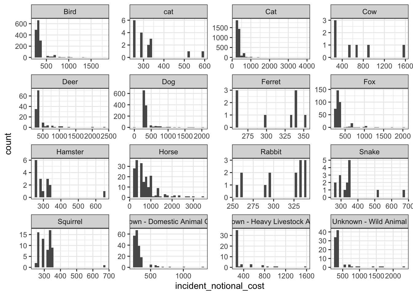
base_plot + geom_density()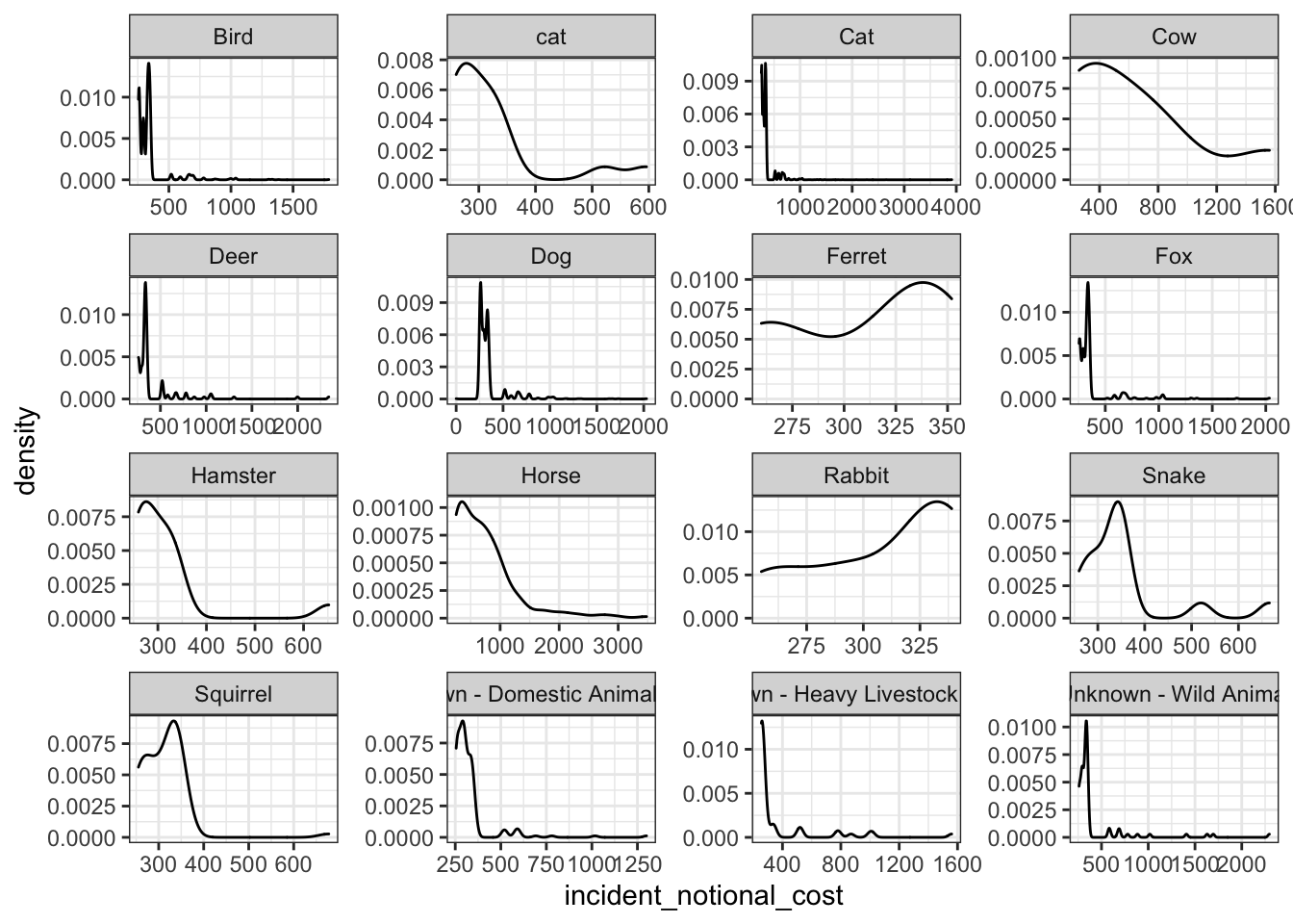
base_plot + geom_boxplot()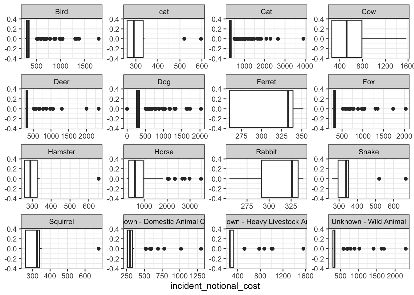
base_plot + stat_ecdf(geom = "step", pad = FALSE) +
  scale_y_continuous(labels = scales::percent)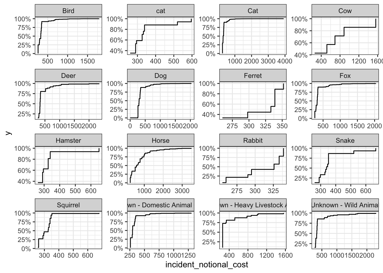
Brief comparison and conclusion about incident group plots
Among the four plots, the box plot can best reflect the variability of this variable. Compared with the other three presentation methods, it can accurately and intuitively depict the discrete distribution of data and the magnitude of change, and identify outliers.
At the same time, we can also draw some conclusions from these images:
Animals such as horses and cows often need to spend more to rescue. This may be because compared to other animals, the search and rescue of these large animals is more difficult, the requirements for supporting equipment are higher, and there are fewer rescue personnel with relevant professional skills, leading to higher accident costs.
For some small animals, such as rabbits, squirrels, and ferrets, often have greater variability in the incident costs. On the one hand, this may because the sub-categories of these species are quite different; On the other hand, because the habitats of these animals are often vary, resulting in differences in the difficulty and cost of search and rescue.
Submit the assignment
Knit the completed R Markdown file as an HTML document (use the “Knit” button at the top of the script editor window) and upload it to Canvas.
Details
- Who did you collaborate with: No one, finish it by myself
- Approximately how much time did you spend on this problem set: 4 hours
- What, if anything, gave you the most trouble: Understand each line of codes of Task 4