Homework 1 and Chanllenges

knitr::opts_chunk$set(
  message = FALSE,
  warning = FALSE,
  tidy=FALSE,     # display code as typed
  size="small")   # slightly smaller font for code
options(digits = 3)

# default figure size
knitr::opts_chunk$set(
  fig.width=6.75,
  fig.height=6.75,
  fig.align = "center"
)
Where Do People Drink The Most Beer, Wine And Spirits?
Back in 2014, fivethiryeight.com published an article on alchohol consumption in different countries. The data drinks is available as part of the fivethirtyeight package. Make sure you have installed the fivethirtyeight package before proceeding.
library(fivethirtyeight)
data(drinks)


# or download directly
# alcohol_direct <- read_csv("https://raw.githubusercontent.com/fivethirtyeight/data/master/alcohol-consumption/drinks.csv")
What are the variable types? Any missing values we should worry about?
The dataset contains five variables, which are devided among three types (logical, numerical and character). There are no missing values.
glimpse(drinks)## Rows: 193
## Columns: 5
## $ country <chr> "Afghanistan", "Albania", "Algeria", "And…
## $ beer_servings <int> 0, 89, 25, 245, 217, 102, 193, 21, 261, 2…
## $ spirit_servings <int> 0, 132, 0, 138, 57, 128, 25, 179, 72, 75,…
## $ wine_servings <int> 0, 54, 14, 312, 45, 45, 221, 11, 212, 191…
## $ total_litres_of_pure_alcohol <dbl> 0.0, 4.9, 0.7, 12.4, 5.9, 4.9, 8.3, 3.8, …skim(drinks)| Name | drinks |
| Number of rows | 193 |
| Number of columns | 5 |
| _______________________ | |
| Column type frequency: | |
| character | 1 |
| numeric | 4 |
| ________________________ | |
| Group variables | None |
Variable type: character
| skim_variable | n_missing | complete_rate | min | max | empty | n_unique | whitespace |
|---|---|---|---|---|---|---|---|
| country | 0 | 1 | 3 | 28 | 0 | 193 | 0 |
Variable type: numeric
| skim_variable | n_missing | complete_rate | mean | sd | p0 | p25 | p50 | p75 | p100 | hist |
|---|---|---|---|---|---|---|---|---|---|---|
| beer_servings | 0 | 1 | 106.16 | 101.14 | 0 | 20.0 | 76.0 | 188.0 | 376.0 | ▇▃▂▂▁ |
| spirit_servings | 0 | 1 | 80.99 | 88.28 | 0 | 4.0 | 56.0 | 128.0 | 438.0 | ▇▃▂▁▁ |
| wine_servings | 0 | 1 | 49.45 | 79.70 | 0 | 1.0 | 8.0 | 59.0 | 370.0 | ▇▁▁▁▁ |
| total_litres_of_pure_alcohol | 0 | 1 | 4.72 | 3.77 | 0 | 1.3 | 4.2 | 7.2 | 14.4 | ▇▃▅▃▁ |
Make a plot that shows the top 25 beer consuming countries
drinks %>%
  slice_max(order_by = beer_servings, n=25) %>%
  mutate(country = fct_reorder(country, beer_servings)) %>%
  ggplot(aes(x=beer_servings, y=country))+
  geom_col(fill='#EBC934')+
  labs(title = "You like beer? These countries do too!",
         subtitle = "Top 25 beer consuming countries",
         x = "Servings per person",
         y = "",
         caption = "Source: https://fivethirtyeight.com/features/dear-mona-followup-where-do-people-drink-the-most-beer-wine-and-spirits/")+
  NULL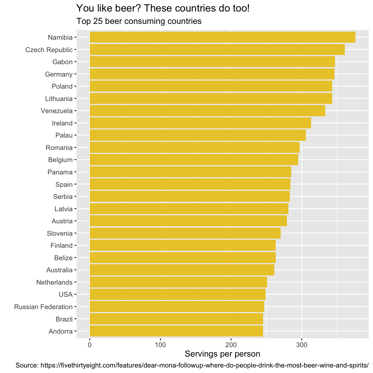
Make a plot that shows the top 25 wine consuming countries
drinks %>%
  slice_max(order_by = wine_servings, n=25) %>%
  mutate(country = fct_reorder(country, wine_servings)) %>%
  ggplot(aes(x=wine_servings, y=country))+
  geom_col(fill='#9C0606')+
  labs(title = "Of course, the French like their wine. \
But what other countries consume most of it?",
         subtitle = "Top 25 wine consuming countries",
         x = "Servings per person",
         y = "",
         caption = "Source: https://fivethirtyeight.com/features/dear-mona-followup-where-do-people-drink-the-most-beer-wine-and-spirits/")+
  NULL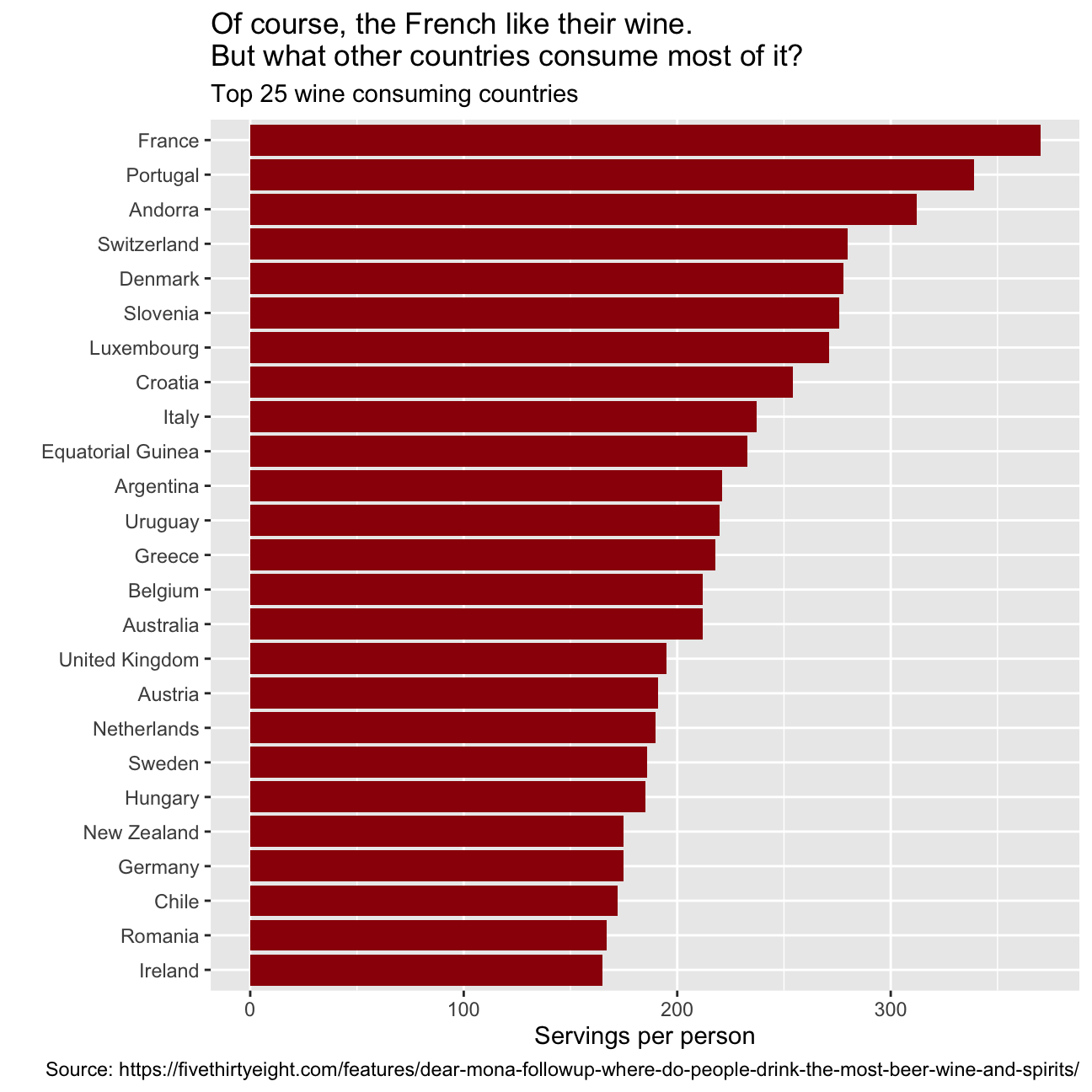
Finally, make a plot that shows the top 25 spirit consuming countries
drinks %>%
slice_max(order_by = spirit_servings, n=25) %>%
mutate(country = fct_reorder(country, spirit_servings)) %>%
ggplot(aes(x=spirit_servings, y=country))+
geom_col(fill='#42069C')+
labs(title = "The number one spirit consumer country will surprise you!\
The others, maybe not",
subtitle = "Top 25 spirits consuming countries",
x = "Servings per person",
y = "",
caption = "Source: https://fivethirtyeight.com/features/dear-mona-followup-where-do-people-drink-the-most-beer-wine-and-spirits/")+
NULL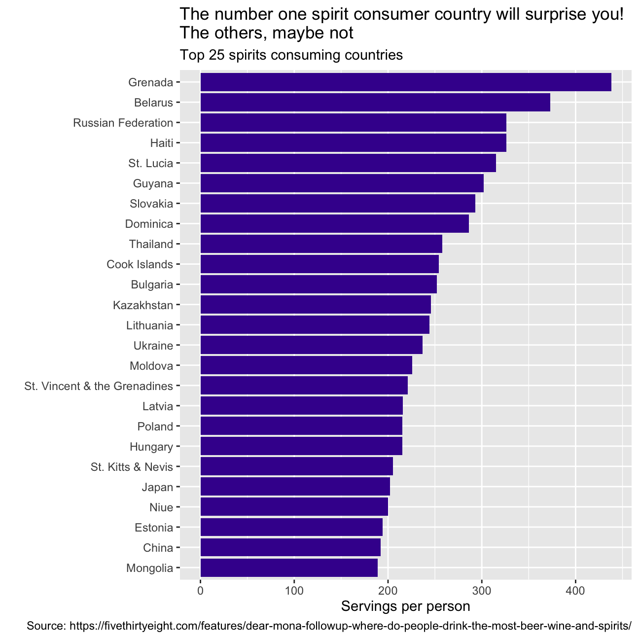 What can you infer from these plots? Don’t just explain what’s in the graph, but speculate or tell a short story (1-2 paragraphs max).
The graphs represent the consumption per person of the three different bevarages in the top 25 consuming countries. They also highlight some strong stereotipes we might have about different countries. For instance, you would be lying if you said that you were not surprised by not seeing Germany as the top 1 country consuming beer! We were surprised as well! In fact, after researching Namibia’s history for a while, we discovered that Namibia was a German colony and went through a series of wars to finally get independent in the late 1990. Drinking beer and alchool was prohibited during this time, so after becoming independent Namibia’s population has adopted beer as a symbol of aparheid and independence. Having people from France, Italy, and Spain in our study group, we were expecting to see those countries among the top 25 consuming countries of wine. So, no surprise on this end. Regarding spirit consumption, we all knew how much Russians love spirits, what we did not know was that the average daily intake of alcohol in Grenada is 40.4 grams of pure alcohol: 7 grams higher than the Average intake worldwide.
Analysis of movies- IMDB dataset
We will look at a subset sample of movies, taken from the Kaggle IMDB 5000 movie dataset
movies <- read_csv(here::here('~/Desktop/MAM assessment/fold/my_website', 'movies.csv'))
glimpse(movies)
## Rows: 2,961
## Columns: 11
## $ title <chr> "Avatar", "Titanic", "Jurassic World", "The Avenge…
## $ genre <chr> "Action", "Drama", "Action", "Action", "Action", "…
## $ director <chr> "James Cameron", "James Cameron", "Colin Trevorrow…
## $ year <dbl> 2009, 1997, 2015, 2012, 2008, 1999, 1977, 2015, 20…
## $ duration <dbl> 178, 194, 124, 173, 152, 136, 125, 141, 164, 93, 1…
## $ gross <dbl> 7.61e+08, 6.59e+08, 6.52e+08, 6.23e+08, 5.33e+08, …
## $ budget <dbl> 2.37e+08, 2.00e+08, 1.50e+08, 2.20e+08, 1.85e+08, …
## $ cast_facebook_likes <dbl> 4834, 45223, 8458, 87697, 57802, 37723, 13485, 920…
## $ votes <dbl> 886204, 793059, 418214, 995415, 1676169, 534658, 9…
## $ reviews <dbl> 3777, 2843, 1934, 2425, 5312, 3917, 1752, 1752, 35…
## $ rating <dbl> 7.9, 7.7, 7.0, 8.1, 9.0, 6.5, 8.7, 7.5, 8.5, 7.2, …Besides the obvious variables of title, genre, director, year, and duration, the rest of the variables are as follows:
gross: The gross earnings in the US box office, not adjusted for inflationbudget: The movie’s budgetcast_facebook_likes: the number of facebook likes cast memebrs receivedvotes: the number of people who voted for (or rated) the movie in IMDBreviews: the number of reviews for that movierating: IMDB average ratingAre there any missing values (NAs)? Are all entries distinct or are there duplicate entries?
There are no missing values in the dataset. There are, however, 54 duplicates (number of rows - number of unique titles).
- Produce a table with the count of movies by genre, ranked in descending order
table0 <- movies %>%
  group_by(genre)%>%
  count(sort=TRUE)
table0
## # A tibble: 17 × 2
## # Groups: genre [17]
## genre n
## <chr> <int>
## 1 Comedy 848
## 2 Action 738
## 3 Drama 498
## 4 Adventure 288
## 5 Crime 202
## 6 Biography 135
## 7 Horror 131
## 8 Animation 35
## 9 Fantasy 28
## 10 Documentary 25
## 11 Mystery 16
## 12 Sci-Fi 7
## 13 Family 3
## 14 Musical 2
## 15 Romance 2
## 16 Western 2
## 17 Thriller 1- Produce a table with the average gross earning and budget (
grossandbudget) by genre. Calculate a variablereturn_on_budgetwhich shows how many $ did a movie make at the box office for each $ of its budget. Ranked genres by thisreturn_on_budgetin descending order
movies %>%
  group_by(genre) %>%
  summarise(mean_gross = mean(gross), mean_budget = mean(budget),
            return_on_budget =mean_gross/mean_budget)  %>%
  arrange(desc(return_on_budget))
## # A tibble: 17 × 4
## genre mean_gross mean_budget return_on_budget
## <chr> <dbl> <dbl> <dbl>
## 1 Musical 92084000 3189500 28.9
## 2 Family 149160478. 14833333. 10.1
## 3 Western 20821884 3465000 6.01
## 4 Documentary 17353973. 5887852. 2.95
## 5 Horror 37713738. 13504916. 2.79
## 6 Fantasy 42408841. 17582143. 2.41
## 7 Comedy 42630552. 24446319. 1.74
## 8 Mystery 67533021. 39218750 1.72
## 9 Animation 98433792. 61701429. 1.60
## 10 Biography 45201805. 28543696. 1.58
## 11 Adventure 95794257. 66290069. 1.45
## 12 Drama 37465371. 26242933. 1.43
## 13 Crime 37502397. 26596169. 1.41
## 14 Romance 31264848. 25107500 1.25
## 15 Action 86583860. 71354888. 1.21
## 16 Sci-Fi 29788371. 27607143. 1.08
## 17 Thriller 2468 300000 0.00823 NULL## NULL- Produce a table that shows the top 15 directors who have created the highest gross revenue in the box office. Don’t just show the total gross amount, but also the mean, median, and standard deviation per director.
movies %>%
   group_by(director)%>%
  summarise(director_gross=sum(gross), mean(gross), median(gross), max(gross)) %>%
  slice_max(order_by= director_gross, n=15)
## # A tibble: 15 × 5
## director director_gross `mean(gross)` `median(gross)` `max(gross)`
## <chr> <dbl> <dbl> <dbl> <dbl>
## 1 Steven Spielberg 4014061704 174524422. 164435221 434949459
## 2 Michael Bay 2231242537 171634041. 138396624 402076689
## 3 Tim Burton 2071275480 129454718. 76519172 334185206
## 4 Sam Raimi 2014600898 201460090. 234903076 403706375
## 5 James Cameron 1909725910 318287652. 175562880. 760505847
## 6 Christopher Nolan 1813227576 226653447 196667606. 533316061
## 7 George Lucas 1741418480 348283696 380262555 474544677
## 8 Robert Zemeckis 1619309108 124562239. 100853835 329691196
## 9 Clint Eastwood 1378321100 72543216. 46700000 350123553
## 10 Francis Lawrence 1358501971 271700394. 281666058 424645577
## 11 Ron Howard 1335988092 111332341 101587923 260031035
## 12 Gore Verbinski 1329600995 189942999. 123207194 423032628
## 13 Andrew Adamson 1137446920 284361730 279680930. 436471036
## 14 Shawn Levy 1129750988 102704635. 85463309 250863268
## 15 Ridley Scott 1128857598 80632686. 47775715 228430993- Finally, ratings. Produce a table that describes how ratings are distributed by genre. We don’t want just the mean, but also, min, max, median, SD and some kind of a histogram or density graph that visually shows how ratings are distributed.
rating_genre <- movies %>%
  group_by(genre) %>%
  summarise(mean = mean(rating), min = min(rating), max = max(rating), median = median(rating),
            stdev = StdDev(rating), count= count(genre))%>%
  arrange(desc(mean))
rating_genre
## # A tibble: 17 × 7
## genre mean min max median stdev[,1] count
## <chr> <dbl> <dbl> <dbl> <dbl> <dbl> <int>
## 1 Biography 7.11 4.5 8.9 7.2 0.760 135
## 2 Crime 6.92 4.8 9.3 6.9 0.849 202
## 3 Mystery 6.86 4.6 8.5 6.9 0.882 16
## 4 Musical 6.75 6.3 7.2 6.75 0.636 2
## 5 Drama 6.73 2.1 8.8 6.8 0.917 498
## 6 Documentary 6.66 1.6 8.5 7.4 1.77 25
## 7 Sci-Fi 6.66 5 8.2 6.4 1.09 7
## 8 Animation 6.65 4.5 8 6.9 0.968 35
## 9 Romance 6.65 6.2 7.1 6.65 0.636 2
## 10 Adventure 6.51 2.3 8.6 6.6 1.09 288
## 11 Family 6.5 5.7 7.9 5.9 1.22 3
## 12 Action 6.23 2.1 9 6.3 1.03 738
## 13 Fantasy 6.15 4.3 7.9 6.45 0.959 28
## 14 Comedy 6.11 1.9 8.8 6.2 1.02 848
## 15 Horror 5.83 3.6 8.5 5.9 1.01 131
## 16 Western 5.7 4.1 7.3 5.7 2.26 2
## 17 Thriller 4.8 4.8 4.8 4.8 NA 1rating_genre %>%
ggplot(aes( x= mean, y= fct_reorder(genre, mean))) +
geom_col(fill ="#42069C") +
labs(title = "How are the ratings of different genres of movies distributed? These types of movies always get high scores!",
subtitle = "Rating distribution of different genres of movies",
x = "Average rating",
y = "",
caption = "https://www.kaggle.com/carolzhangdc/imdb-5000-movie-dataset")+
NULL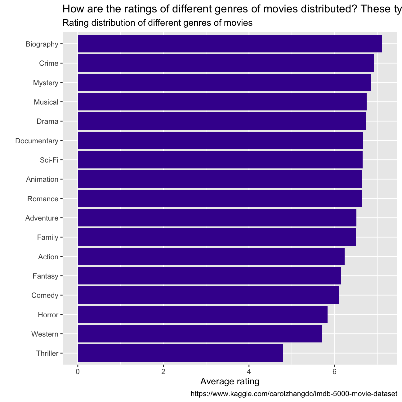
- Examine the relationship between
grossandcast_facebook_likes. Produce a scatterplot and write one sentence discussing whether the number of facebook likes that the cast has received is likely to be a good predictor of how much money a movie will make at the box office. What variable are you going to map to the Y- and X- axes?
skim(movies)| Name | movies |
| Number of rows | 2961 |
| Number of columns | 11 |
| _______________________ | |
| Column type frequency: | |
| character | 3 |
| numeric | 8 |
| ________________________ | |
| Group variables | None |
Variable type: character
| skim_variable | n_missing | complete_rate | min | max | empty | n_unique | whitespace |
|---|---|---|---|---|---|---|---|
| title | 0 | 1 | 1 | 83 | 0 | 2907 | 0 |
| genre | 0 | 1 | 5 | 11 | 0 | 17 | 0 |
| director | 0 | 1 | 3 | 32 | 0 | 1366 | 0 |
Variable type: numeric
| skim_variable | n_missing | complete_rate | mean | sd | p0 | p25 | p50 | p75 | p100 | hist |
|---|---|---|---|---|---|---|---|---|---|---|
| year | 0 | 1 | 2.00e+03 | 9.95e+00 | 1920.0 | 2.00e+03 | 2.00e+03 | 2.01e+03 | 2.02e+03 | ▁▁▁▂▇ |
| duration | 0 | 1 | 1.10e+02 | 2.22e+01 | 37.0 | 9.50e+01 | 1.06e+02 | 1.19e+02 | 3.30e+02 | ▃▇▁▁▁ |
| gross | 0 | 1 | 5.81e+07 | 7.25e+07 | 703.0 | 1.23e+07 | 3.47e+07 | 7.56e+07 | 7.61e+08 | ▇▁▁▁▁ |
| budget | 0 | 1 | 4.06e+07 | 4.37e+07 | 218.0 | 1.10e+07 | 2.60e+07 | 5.50e+07 | 3.00e+08 | ▇▂▁▁▁ |
| cast_facebook_likes | 0 | 1 | 1.24e+04 | 2.05e+04 | 0.0 | 2.24e+03 | 4.60e+03 | 1.69e+04 | 6.57e+05 | ▇▁▁▁▁ |
| votes | 0 | 1 | 1.09e+05 | 1.58e+05 | 5.0 | 1.99e+04 | 5.57e+04 | 1.33e+05 | 1.69e+06 | ▇▁▁▁▁ |
| reviews | 0 | 1 | 5.03e+02 | 4.94e+02 | 2.0 | 1.99e+02 | 3.64e+02 | 6.31e+02 | 5.31e+03 | ▇▁▁▁▁ |
| rating | 0 | 1 | 6.39e+00 | 1.05e+00 | 1.6 | 5.80e+00 | 6.50e+00 | 7.10e+00 | 9.30e+00 | ▁▁▆▇▁ |
table <- select(movies,c("gross","cast_facebook_likes"))

ggplot(movies, aes(x=gross , y=cast_facebook_likes))+
  geom_point()+
  xlim(0,400000000) +
  ylim(0,200000)+
  labs(title = "Is the gross earnings of the movie related to facebook likes?",
         subtitle = "Relationship between gross earnings and facebook likes",
         x = "Gross earnings of movies",
         y = "The number of facebook likes cast members received",
         caption = "https://www.kaggle.com/carolzhangdc/imdb-5000-movie-dataset")+
  geom_smooth(method = "lm")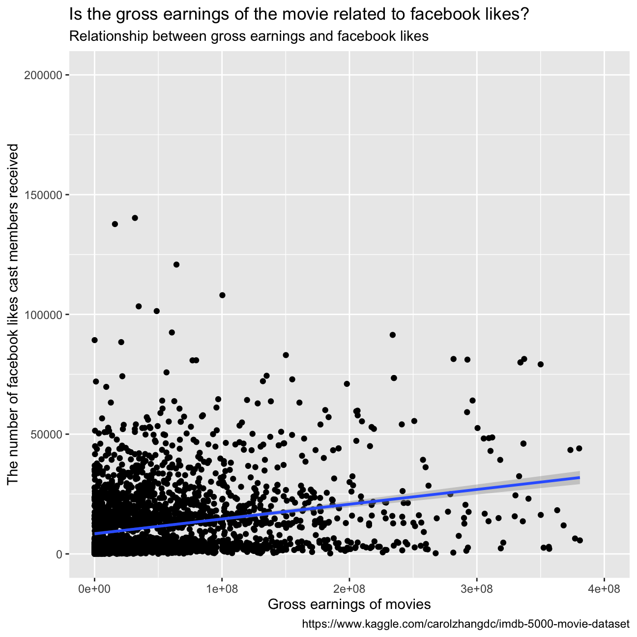
The graph does not depict a clear and strong correlation between the number of facebook likes that the cast has received and the gross earnings of the movie. Therefore, we can conclude that it is not a good predictor of how much money a movie will make at the box office. Furthermore, we plotted the facebook likes with the gross earnings adding a linear regression: as we can see in the graph below, the fitted model is not accurate representation of the data. Sequantally, we cannot conclude anything about the relationship between the two variables.
ggplot(movies, aes(x=gross, y=cast_facebook_likes)) +
  geom_point()+
  xlim(0, 300000000)+
  ylim(0, 100000)+
  labs(title = "Is the gross earnings of the movie related to facebook likes?",
         subtitle = "Relationship between gross earnings and facebook likes",
         x = "Gross earnings of movies",
         y = "The number of facebook likes cast members received",
         caption = "https://www.kaggle.com/carolzhangdc/imdb-5000-movie-dataset")+
  geom_smooth(method='lm')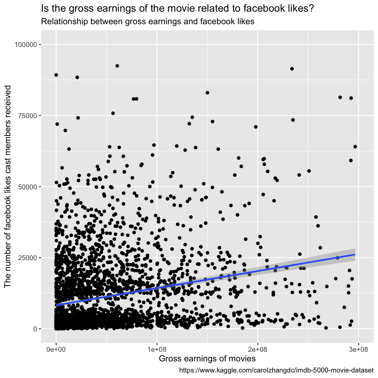
summary(lm(cast_facebook_likes ~ gross, movies))##
## Call:
## lm(formula = cast_facebook_likes ~ gross, data = movies)
##
## Residuals:
## Min 1Q Median 3Q Max
## -49976 -8702 -6337 4699 642763
##
## Coefficients:
## Estimate Std. Error t value Pr(>|t|)
## (Intercept) 8.89e+03 4.73e+02 18.8 <2e-16 ***
## gross 6.04e-05 5.09e-06 11.9 <2e-16 ***
## ---
## Signif. codes: 0 '***' 0.001 '**' 0.01 '*' 0.05 '.' 0.1 ' ' 1
##
## Residual standard error: 20100 on 2959 degrees of freedom
## Multiple R-squared: 0.0454, Adjusted R-squared: 0.0451
## F-statistic: 141 on 1 and 2959 DF, p-value: <2e-16- Examine the relationship between
grossandbudget. Produce a scatterplot and write one sentence discussing whether budget is likely to be a good predictor of how much money a movie will make at the box office.
ggplot(movies, aes(x=gross , y=budget))+
  geom_point()+
  labs(title = "Is the gross earnings of the movie related to movie budgets?",
         subtitle = "Relationship between gross earnings and movie budgets",
         x = "Gross earnings of movies",
         y = "The movie's budget",
         caption = "https://www.kaggle.com/carolzhangdc/imdb-5000-movie-dataset")+
  geom_smooth(method= "lm")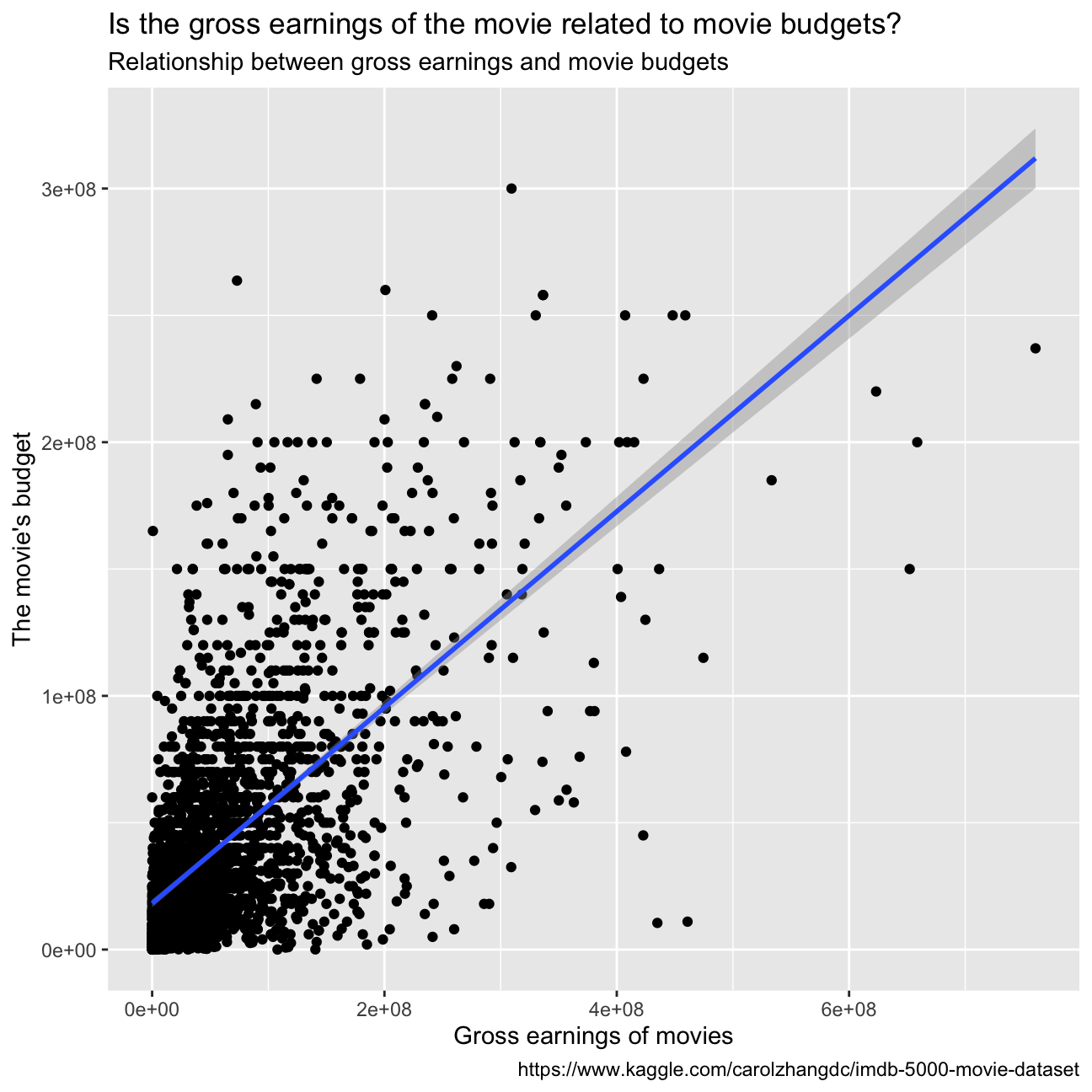
While the scales of the two variables are extremely different, we can say that the higher the budget, the higher the gross earnings.
- Examine the relationship between
grossandrating. Produce a scatterplot, faceted bygenreand discuss whether IMDB ratings are likely to be a good predictor of how much money a movie will make at the box office. Is there anything strange in this dataset?
ggplot(movies, aes(x=gross , y=rating))+
  geom_point()+
  labs(title = "Is the gross earnings of the movie related to movie ratings?",
         subtitle = "Relationship between gross earnings of movies and movie ratings",
         x = "Gross earnings of movies",
         y = "Movie ratings",
         caption = "https://www.kaggle.com/carolzhangdc/imdb-5000-movie-dataset")+
  geom_smooth(method ="lm")+
  facet_wrap(~genre)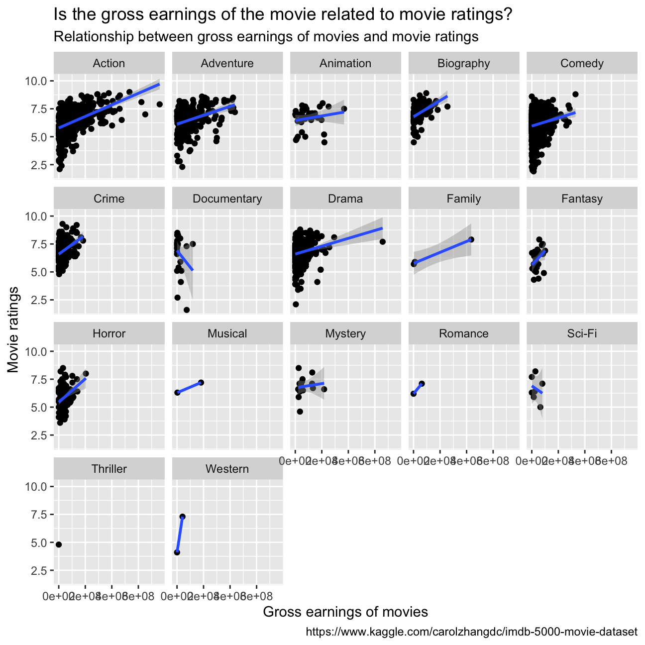
The dataset presents some limitations: as we can see from “table0”, there are many genres that are underrepresented in the number of datapoints (Thriller 1, Western 2, Romance 2, Musical 2, Family 3 vs Comedy 848 e.g.). This does not allow to make the same studies/comparisons between the different genres. To answer the question, we cannot infer a sure relationship between the IMDB ratings and the gross earnings for every genre. For the ones with enough datapoints, we observe a positive correlation between the ratings and the gross earnings, especially for Action, Horror, Drama, Adventure.
Returns of financial stocks
In this task we will try to understand how chosen tickers compare in risk and return. We chose the following list of tickers from the dataset “nyse.csv” and then compared their performance with the one of SPY: “KO”: Coca-Cola Company (The) “ACN”: Accenture plc “BA”: Boeing Company (The) “GS”: Goldman Sachs Group, Inc. (The) “NKE”: Nike, Inc. “NVO”: Novo Nordisk A/S
nyse <- read_csv(here::here("~/Desktop/MAM assessment/fold/my_website","nyse.csv"))
skim(nyse)| Name | nyse |
| Number of rows | 508 |
| Number of columns | 6 |
| _______________________ | |
| Column type frequency: | |
| character | 6 |
| ________________________ | |
| Group variables | None |
Variable type: character
| skim_variable | n_missing | complete_rate | min | max | empty | n_unique | whitespace |
|---|---|---|---|---|---|---|---|
| symbol | 0 | 1 | 1 | 4 | 0 | 508 | 0 |
| name | 0 | 1 | 5 | 48 | 0 | 505 | 0 |
| ipo_year | 0 | 1 | 3 | 4 | 0 | 33 | 0 |
| sector | 0 | 1 | 6 | 21 | 0 | 12 | 0 |
| industry | 0 | 1 | 5 | 62 | 0 | 103 | 0 |
| summary_quote | 0 | 1 | 31 | 34 | 0 | 508 | 0 |
Based on this dataset, create a table and a bar plot that shows the number of companies per sector, in descending order
companies_per_sector <- nyse  %>%
  group_by(sector)  %>%
  summarise(count=count(sector))  %>%
  arrange(desc(count))

companies_per_sector %>%
  ggplot(aes( x= count, y= fct_reorder(sector, count))) +
  geom_col(fill= "#42069C") +
  labs(title = "How are the numbers of different sectors of company \
distributed? ",
         subtitle = "Number of companies per sector ",
         x = "Number of companies",
         y = "",
         caption = "https://mam2022.netlify.app/reference/finance_data/")+
  geom_smooth(method ="lm")+
 NULL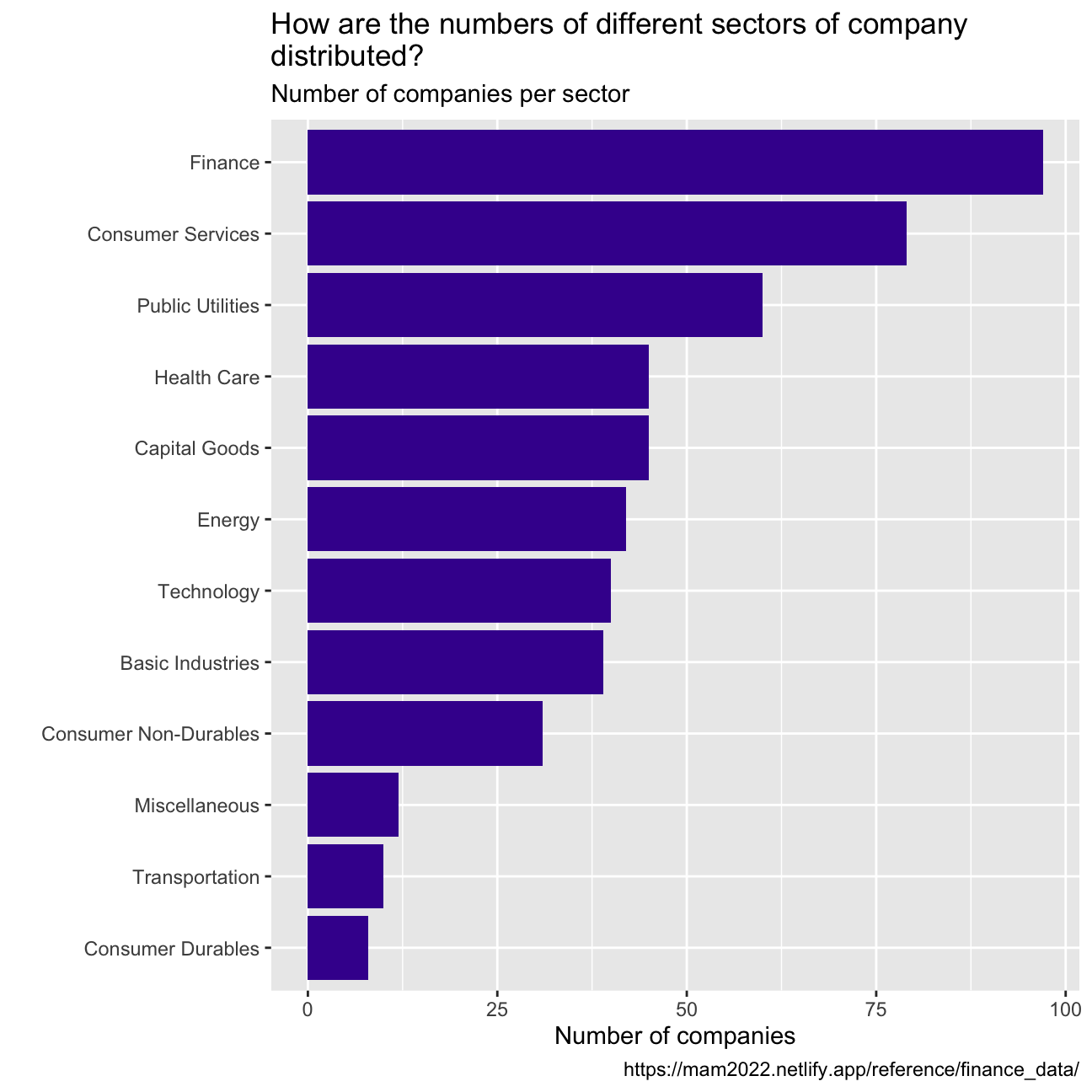
myStocks <- c("KO","ACN","BA","GS","NKE","NVO","SPY" ) %>%
  tq_get(get  = "stock.prices",
         from = "2011-01-01",
         to   = "2021-08-31") %>%
  group_by(symbol)
  NULL
## NULLglimpse(myStocks) # examine the structure of the resulting data frame## Rows: 18,781
## Columns: 8
## Groups: symbol [7]
## $ symbol <chr> "KO", "KO", "KO", "KO", "KO", "KO", "KO", "KO", "KO", "KO", "…
## $ date <date> 2011-01-03, 2011-01-04, 2011-01-05, 2011-01-06, 2011-01-07, …
## $ open <dbl> 32.9, 32.5, 31.9, 31.8, 31.4, 31.4, 31.7, 31.6, 31.6, 31.7, 3…
## $ high <dbl> 32.9, 32.6, 32.0, 31.8, 31.5, 31.6, 31.7, 31.7, 31.9, 31.7, 3…
## $ low <dbl> 32.6, 31.9, 31.4, 31.4, 31.3, 31.3, 31.3, 31.4, 31.6, 31.5, 3…
## $ close <dbl> 32.6, 31.9, 31.7, 31.5, 31.5, 31.5, 31.3, 31.5, 31.7, 31.6, 3…
## $ volume <dbl> 18945600, 27940400, 34379000, 21712400, 16592800, 14904600, 1…
## $ adjusted <dbl> 23.4, 22.9, 22.7, 22.6, 22.5, 22.6, 22.4, 22.6, 22.7, 22.6, 2…skim(myStocks)| Name | myStocks |
| Number of rows | 18781 |
| Number of columns | 8 |
| _______________________ | |
| Column type frequency: | |
| Date | 1 |
| numeric | 6 |
| ________________________ | |
| Group variables | symbol |
Variable type: Date
| skim_variable | symbol | n_missing | complete_rate | min | max | median | n_unique |
|---|---|---|---|---|---|---|---|
| date | ACN | 0 | 1 | 2011-01-03 | 2021-08-30 | 2016-05-03 | 2683 |
| date | BA | 0 | 1 | 2011-01-03 | 2021-08-30 | 2016-05-03 | 2683 |
| date | GS | 0 | 1 | 2011-01-03 | 2021-08-30 | 2016-05-03 | 2683 |
| date | KO | 0 | 1 | 2011-01-03 | 2021-08-30 | 2016-05-03 | 2683 |
| date | NKE | 0 | 1 | 2011-01-03 | 2021-08-30 | 2016-05-03 | 2683 |
| date | NVO | 0 | 1 | 2011-01-03 | 2021-08-30 | 2016-05-03 | 2683 |
| date | SPY | 0 | 1 | 2011-01-03 | 2021-08-30 | 2016-05-03 | 2683 |
Variable type: numeric
| skim_variable | symbol | n_missing | complete_rate | mean | sd | p0 | p25 | p50 | p75 | p100 | hist |
|---|---|---|---|---|---|---|---|---|---|---|---|
| open | ACN | 0 | 1 | 1.27e+02 | 6.47e+01 | 4.81e+01 | 7.65e+01 | 1.13e+02 | 1.64e+02 | 3.35e+02 | ▇▅▂▁▁ |
| open | BA | 0 | 1 | 1.81e+02 | 1.01e+02 | 5.75e+01 | 1.07e+02 | 1.43e+02 | 2.42e+02 | 4.46e+02 | ▇▅▂▃▁ |
| open | GS | 0 | 1 | 1.91e+02 | 5.85e+01 | 8.81e+01 | 1.57e+02 | 1.87e+02 | 2.23e+02 | 4.20e+02 | ▃▇▃▁▁ |
| open | KO | 0 | 1 | 4.33e+01 | 6.08e+00 | 3.12e+01 | 3.93e+01 | 4.25e+01 | 4.64e+01 | 5.98e+01 | ▃▇▆▂▂ |
| open | NKE | 0 | 1 | 6.08e+01 | 3.39e+01 | 1.88e+01 | 3.31e+01 | 5.48e+01 | 8.02e+01 | 1.74e+02 | ▇▇▃▂▁ |
| open | NVO | 0 | 1 | 4.62e+01 | 1.50e+01 | 1.92e+01 | 3.42e+01 | 4.65e+01 | 5.50e+01 | 1.07e+02 | ▆▇▅▁▁ |
| open | SPY | 0 | 1 | 2.29e+02 | 7.73e+01 | 1.08e+02 | 1.69e+02 | 2.11e+02 | 2.79e+02 | 4.51e+02 | ▆▇▆▂▁ |
| high | ACN | 0 | 1 | 1.28e+02 | 6.52e+01 | 4.85e+01 | 7.72e+01 | 1.14e+02 | 1.66e+02 | 3.39e+02 | ▇▅▂▁▁ |
| high | BA | 0 | 1 | 1.83e+02 | 1.02e+02 | 5.92e+01 | 1.08e+02 | 1.44e+02 | 2.45e+02 | 4.46e+02 | ▇▃▂▂▁ |
| high | GS | 0 | 1 | 1.93e+02 | 5.90e+01 | 8.93e+01 | 1.59e+02 | 1.88e+02 | 2.25e+02 | 4.21e+02 | ▃▇▃▁▁ |
| high | KO | 0 | 1 | 4.36e+01 | 6.12e+00 | 3.13e+01 | 3.96e+01 | 4.28e+01 | 4.67e+01 | 6.01e+01 | ▃▇▆▃▂ |
| high | NKE | 0 | 1 | 6.14e+01 | 3.42e+01 | 1.91e+01 | 3.33e+01 | 5.53e+01 | 8.12e+01 | 1.74e+02 | ▇▇▃▂▁ |
| high | NVO | 0 | 1 | 4.65e+01 | 1.51e+01 | 1.93e+01 | 3.44e+01 | 4.68e+01 | 5.54e+01 | 1.07e+02 | ▆▇▅▁▁ |
| high | SPY | 0 | 1 | 2.30e+02 | 7.77e+01 | 1.13e+02 | 1.69e+02 | 2.11e+02 | 2.80e+02 | 4.53e+02 | ▆▇▆▂▁ |
| low | ACN | 0 | 1 | 1.26e+02 | 6.42e+01 | 4.74e+01 | 7.60e+01 | 1.12e+02 | 1.62e+02 | 3.33e+02 | ▇▅▂▁▁ |
| low | BA | 0 | 1 | 1.79e+02 | 9.93e+01 | 5.60e+01 | 1.06e+02 | 1.41e+02 | 2.39e+02 | 4.40e+02 | ▇▅▂▃▁ |
| low | GS | 0 | 1 | 1.90e+02 | 5.80e+01 | 8.43e+01 | 1.55e+02 | 1.85e+02 | 2.21e+02 | 4.13e+02 | ▃▇▃▁▁ |
| low | KO | 0 | 1 | 4.30e+01 | 6.03e+00 | 3.06e+01 | 3.91e+01 | 4.22e+01 | 4.61e+01 | 5.96e+01 | ▂▇▆▂▂ |
| low | NKE | 0 | 1 | 6.02e+01 | 3.35e+01 | 1.74e+01 | 3.29e+01 | 5.45e+01 | 7.97e+01 | 1.73e+02 | ▇▇▃▂▁ |
| low | NVO | 0 | 1 | 4.59e+01 | 1.49e+01 | 1.89e+01 | 3.40e+01 | 4.62e+01 | 5.46e+01 | 1.06e+02 | ▆▇▅▁▁ |
| low | SPY | 0 | 1 | 2.28e+02 | 7.69e+01 | 1.07e+02 | 1.68e+02 | 2.10e+02 | 2.78e+02 | 4.51e+02 | ▆▇▆▂▁ |
| close | ACN | 0 | 1 | 1.27e+02 | 6.48e+01 | 4.74e+01 | 7.66e+01 | 1.13e+02 | 1.64e+02 | 3.37e+02 | ▇▅▂▁▁ |
| close | BA | 0 | 1 | 1.81e+02 | 1.01e+02 | 5.74e+01 | 1.07e+02 | 1.42e+02 | 2.42e+02 | 4.41e+02 | ▇▅▂▃▁ |
| close | GS | 0 | 1 | 1.91e+02 | 5.86e+01 | 8.77e+01 | 1.57e+02 | 1.86e+02 | 2.23e+02 | 4.20e+02 | ▃▇▃▁▁ |
| close | KO | 0 | 1 | 4.33e+01 | 6.08e+00 | 3.08e+01 | 3.93e+01 | 4.25e+01 | 4.65e+01 | 6.01e+01 | ▂▇▆▃▁ |
| close | NKE | 0 | 1 | 6.08e+01 | 3.39e+01 | 1.89e+01 | 3.31e+01 | 5.49e+01 | 8.04e+01 | 1.74e+02 | ▇▇▃▂▁ |
| close | NVO | 0 | 1 | 4.63e+01 | 1.50e+01 | 1.89e+01 | 3.42e+01 | 4.66e+01 | 5.50e+01 | 1.07e+02 | ▆▇▅▁▁ |
| close | SPY | 0 | 1 | 2.29e+02 | 7.74e+01 | 1.10e+02 | 1.69e+02 | 2.11e+02 | 2.79e+02 | 4.52e+02 | ▆▇▆▂▁ |
| volume | ACN | 0 | 1 | 2.74e+06 | 2.35e+06 | 5.28e+05 | 1.80e+06 | 2.31e+06 | 3.08e+06 | 8.97e+07 | ▇▁▁▁▁ |
| volume | BA | 0 | 1 | 7.36e+06 | 9.68e+06 | 7.89e+05 | 3.19e+06 | 4.35e+06 | 6.62e+06 | 1.03e+08 | ▇▁▁▁▁ |
| volume | GS | 0 | 1 | 3.71e+06 | 2.11e+06 | 4.68e+05 | 2.40e+06 | 3.13e+06 | 4.41e+06 | 2.45e+07 | ▇▁▁▁▁ |
| volume | KO | 0 | 1 | 1.45e+07 | 6.44e+06 | 3.00e+06 | 1.06e+07 | 1.32e+07 | 1.66e+07 | 9.90e+07 | ▇▁▁▁▁ |
| volume | NKE | 0 | 1 | 8.44e+06 | 5.06e+06 | 1.82e+06 | 5.65e+06 | 7.34e+06 | 9.58e+06 | 8.63e+07 | ▇▁▁▁▁ |
| volume | NVO | 0 | 1 | 1.61e+06 | 1.18e+06 | 1.94e+05 | 9.37e+05 | 1.29e+06 | 1.88e+06 | 1.44e+07 | ▇▁▁▁▁ |
| volume | SPY | 0 | 1 | 1.13e+08 | 6.69e+07 | 2.03e+07 | 6.81e+07 | 9.62e+07 | 1.37e+08 | 7.18e+08 | ▇▂▁▁▁ |
| adjusted | ACN | 0 | 1 | 1.19e+02 | 6.75e+01 | 3.88e+01 | 6.57e+01 | 1.04e+02 | 1.57e+02 | 3.37e+02 | ▇▅▂▁▁ |
| adjusted | BA | 0 | 1 | 1.70e+02 | 1.03e+02 | 4.67e+01 | 9.12e+01 | 1.28e+02 | 2.40e+02 | 4.30e+02 | ▇▃▂▂▁ |
| adjusted | GS | 0 | 1 | 1.77e+02 | 6.14e+01 | 7.51e+01 | 1.39e+02 | 1.69e+02 | 2.09e+02 | 4.18e+02 | ▅▇▃▁▁ |
| adjusted | KO | 0 | 1 | 3.70e+01 | 8.58e+00 | 2.22e+01 | 3.06e+01 | 3.57e+01 | 4.25e+01 | 5.70e+01 | ▅▇▆▃▂ |
| adjusted | NKE | 0 | 1 | 5.84e+01 | 3.45e+01 | 1.67e+01 | 3.03e+01 | 5.19e+01 | 7.82e+01 | 1.74e+02 | ▇▆▃▂▁ |
| adjusted | NVO | 0 | 1 | 4.22e+01 | 1.60e+01 | 1.54e+01 | 2.92e+01 | 4.22e+01 | 4.95e+01 | 1.07e+02 | ▆▇▂▁▁ |
| adjusted | SPY | 0 | 1 | 2.12e+02 | 8.40e+01 | 9.08e+01 | 1.45e+02 | 1.89e+02 | 2.66e+02 | 4.52e+02 | ▇▇▆▂▁ |
Financial performance analysis depends on returns; If I buy a stock today for 100 and I sell it tomorrow for 101.75, my one-day return, assuming no transaction costs, is 1.75%. So given the adjusted closing prices, our first step is to calculate daily and monthly returns.
#calculate daily returns
myStocks_returns_daily <- myStocks %>%
  tq_transmute(select     = adjusted,
               mutate_fun = periodReturn,
               period     = "daily",
               type       = "log",
               col_rename = "daily_returns",
               cols = c(nested.col))

#calculate monthly  returns
myStocks_returns_monthly <- myStocks %>%
  tq_transmute(select     = adjusted,
               mutate_fun = periodReturn,
               period     = "monthly",
               type       = "arithmetic",
               col_rename = "monthly_returns",
               cols = c(nested.col))

#calculate yearly returns
myStocks_returns_annual <- myStocks %>%
  group_by(symbol) %>%
  tq_transmute(select     = adjusted,
               mutate_fun = periodReturn,
               period     = "yearly",
               type       = "arithmetic",
               col_rename = "yearly_returns",
               cols = c(nested.col))
Create a table where you summarise monthly returns for each of the stocks and SPY; min, max, median, mean, SD.
stock_returns_monthly <- myStocks_returns_monthly %>%
  group_by(symbol) %>%
  summarise(min=min(monthly_returns), mix=max(monthly_returns), mean=mean(monthly_returns), stdv= StdDev(monthly_returns))

stock_returns_monthly
## # A tibble: 7 × 5
## symbol min mix mean stdv[,1]
## <chr> <dbl> <dbl> <dbl> <dbl>
## 1 ACN -0.143 0.158 0.0185 0.0566
## 2 BA -0.458 0.459 0.0157 0.0948
## 3 GS -0.230 0.234 0.0115 0.0825
## 4 KO -0.165 0.0849 0.00774 0.0426
## 5 NKE -0.189 0.156 0.0191 0.0623
## 6 NVO -0.172 0.198 0.0157 0.0638
## 7 SPY -0.125 0.127 0.0123 0.0381Plot a density plot, using geom_density(), for each of the stocks
myStocks_returns_monthly  %>%
  ggplot(aes(x=monthly_returns))  +
  geom_density(color="#42069C")+
  labs(title = "Monthly returns of each of stock ",
         x = "Monthly returns",
         y = "",
         caption = "https://mam2022.netlify.app/reference/finance_data/")+
  facet_wrap(~symbol)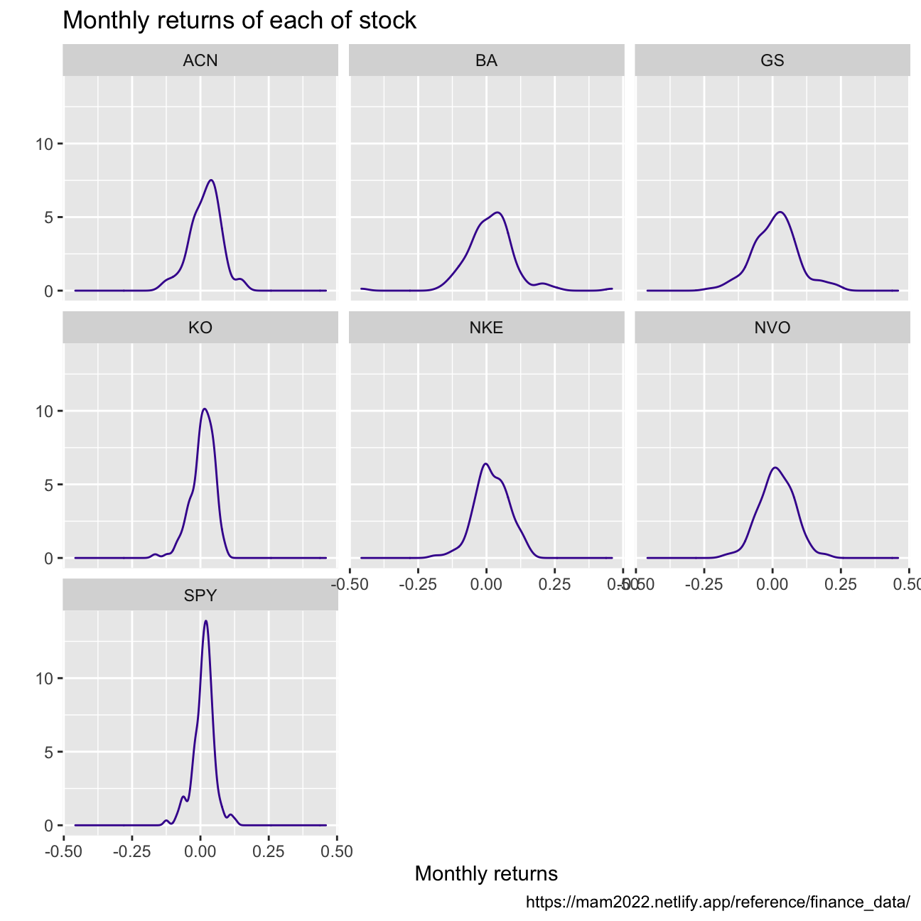
What can you infer from this plot? Which stock is the riskiest? The least risky?
>
The sharpness of the curve gives us information of the distribution around the mean of the returns. This inharently represents variance, which is also an indicator of risk.
We can conclude that:
1. The SP500 Index is the least risky since it is also the sharpest bell.
2. The two stocks with the highest volatility and therefore the most risky stocks are Boeing (BA) and Goldman Sachs (GS). We could explain the high volatility in returns of BA by looking at the uncertainty in the air travel industry mostly cause by the global pandemic but also other historical events.
Finally, make a plot that shows the expected monthly return (mean) of a stock on the Y axis and the risk (standard deviation) in the X-axis. Please use ggrepel::geom_text_repel() to label each stock
stock_returns_monthly %>%
  ggplot(aes(x=stdv, y= mean))+
  geom_point(color="#42069C") +
  labs(title = "High return means high risk? See what are outliers!",
        subtitle = "Relationship between expected monthly return and risk",
         x = "Monthly returns",
         y = "Risk",
         caption = "https://mam2022.netlify.app/reference/finance_data/")+
  ggrepel::geom_text_repel(aes(label = symbol),
                     nudge_x = 0,
                     na.rm = TRUE)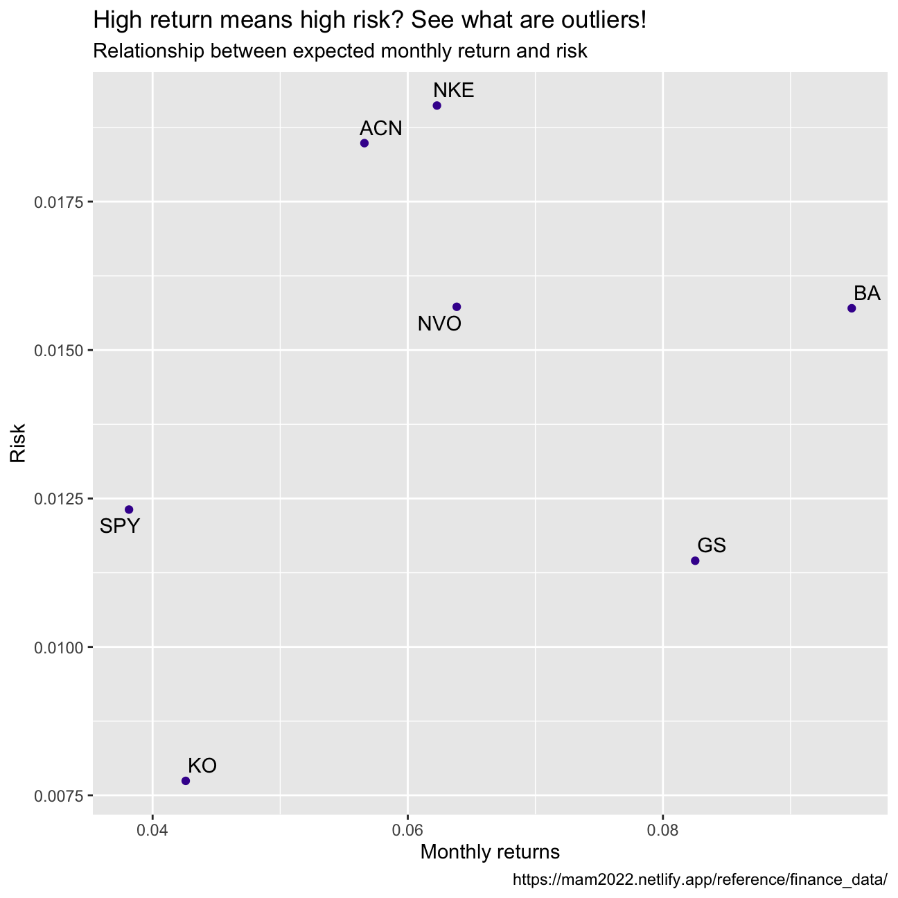
What can you infer from this plot? Are there any stocks which, while being riskier, do not have a higher expected return?
We would expect to see an ideal investment with high returns and a relatively low risk at the top left corner of this graph. The different points that we obtained allow us to visually compare the selected stocks in terms of risk and return. Looking at the graph, it becomes clear that some stocks are riskier but do not have higher expected returns compared to the peers; This is the case of GS and BA. We find GS to be a particular poor investment compared to the others since it has the second highest risk while having only the second lowest expected return.
On your own: IBM HR Analytics
IBM HR Dataset
Description of key statistics
This data set is a fictional dataset created by IBM data scientists. It provides data on key human resources variables, such as income, age, education, gender, attrition and others. The dataset contains 1470 observations for 19 variables, and it has no missing values. We will deep dive into some key statistics to better understand the fictional IBM Workplace.
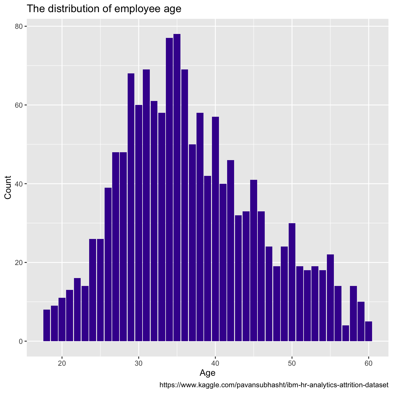
Firstly we will look into attrition, which refers to the percentage of people within the dataset that have left the country. Out of the whole dataset, 237 employees left the company, which results in an attrition of 16.1%.The age distribution for people who left the company can be seen in Figure 1. If we compare this distribution to the close to normal age distribution of the whole company in Figure 2, we see that they clearly differ. Younger and older employees are most likely to leave, as the percentage of leavers for those age groups is higher than their percentage of total employees.
hr_dataset <- read_csv(here::here("~/Desktop/am01/data", "datasets_1067_1925_WA_Fn-UseC_-HR-Employee-Attrition.csv"))
#glimpse(hr_dataset)
hr_cleaned <- hr_dataset %>%
clean_names() %>%
mutate(
education = case_when(
education == 1 ~ "Below College",
education == 2 ~ "College",
education == 3 ~ "Bachelor",
education == 4 ~ "Master",
education == 5 ~ "Doctor"
),
environment_satisfaction = case_when(
environment_satisfaction == 1 ~ "Low",
environment_satisfaction == 2 ~ "Medium",
environment_satisfaction == 3 ~ "High",
environment_satisfaction == 4 ~ "Very High"
),
job_satisfaction = case_when(
job_satisfaction == 1 ~ "Low",
job_satisfaction == 2 ~ "Medium",
job_satisfaction == 3 ~ "High",
job_satisfaction == 4 ~ "Very High"
),
performance_rating = case_when(
performance_rating == 1 ~ "Low",
performance_rating == 2 ~ "Good",
performance_rating == 3 ~ "Excellent",
performance_rating == 4 ~ "Outstanding"
),
work_life_balance = case_when(
work_life_balance == 1 ~ "Bad",
work_life_balance == 2 ~ "Good",
work_life_balance == 3 ~ "Better",
work_life_balance == 4 ~ "Best"
)
) %>%
select(age, attrition, daily_rate, department,
distance_from_home, education,
gender, job_role,environment_satisfaction,
job_satisfaction, marital_status,
monthly_income, num_companies_worked, percent_salary_hike,
performance_rating, total_working_years,
work_life_balance, years_at_company,
years_since_last_promotion)number_of_attrition <- hr_cleaned %>%
filter(attrition == "Yes")
number_of_attrition%>%
ggplot(aes(x=age, y=count(age)))+
geom_col(fill="#42069C")
number_of_attrition=number_of_attrition%>%
count()
total_number <- hr_cleaned %>%
count()
#the relative rate of attrition would be
attrition = number_of_attrition/ total_number
#age
hr_cleaned%>%
ggplot(aes(x=age)) +
geom_bar(fill="#42069C")+
labs(title = "The distribution of employee age",
x = "Age",
y = "Count",
caption = "https://www.kaggle.com/pavansubhasht/ibm-hr-analytics-attrition-dataset")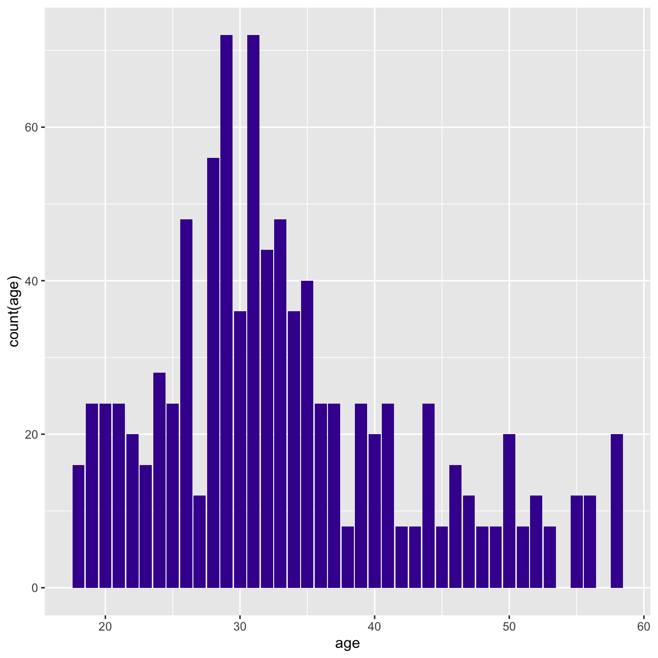
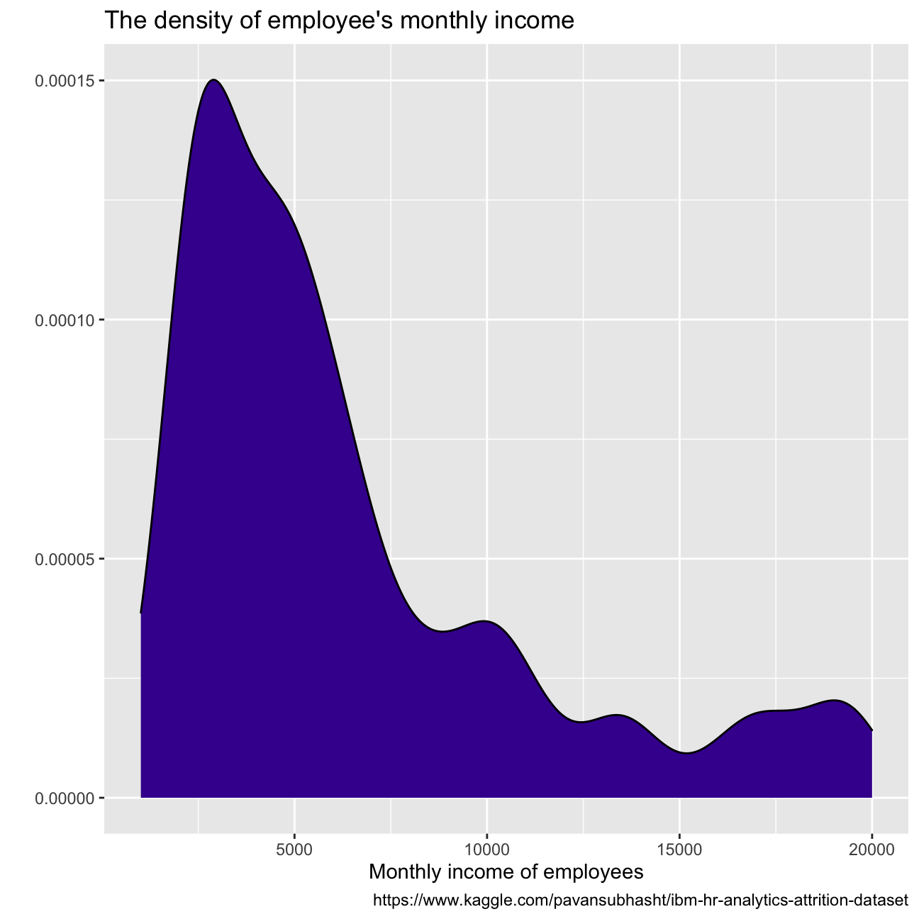
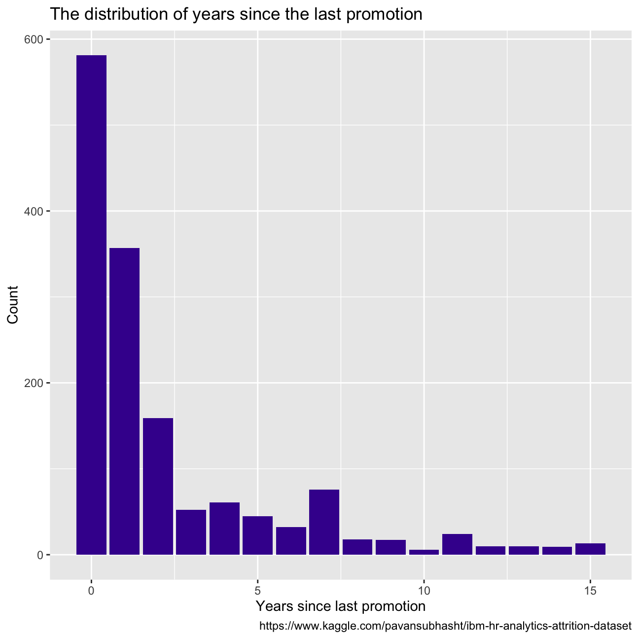
Some other key variable distributions can be observed in the figures below, all right-skewed. Years since last promotion shows almost exponential distribution tendency, with most employees receiving a promotion within the last year. There seems to be a big drop in employees with more than 10 years working at the company, and most employees make between USD 9k and USD 1k per month.
#years_at_company
hr_cleaned%>%
  ggplot(aes(x=years_at_company))+
  geom_bar(fill="#42069C") +
  labs(title = "The distribution of employee's tenure",
       x = "Employee tenure",
       y = "Count",
       caption = "https://www.kaggle.com/pavansubhasht/ibm-hr-analytics-attrition-dataset")

#monthly_income is continuous variable so we do density
hr_cleaned%>%
  ggplot(aes(x=monthly_income))+
  geom_density(fill="#42069C") +
  labs(title = "The density of employee's monthly income",
       x = "Monthly income of employees",
       y = "",
       caption = "https://www.kaggle.com/pavansubhasht/ibm-hr-analytics-attrition-dataset")


#years_since_last_promotion
hr_cleaned%>%
  ggplot(aes(x=years_since_last_promotion))+
  geom_bar(fill="#42069C") +
  labs(title = "The distribution of years since the last promotion",
       x = "Years since last promotion",
       y = "Count",
       caption = "https://www.kaggle.com/pavansubhasht/ibm-hr-analytics-attrition-dataset")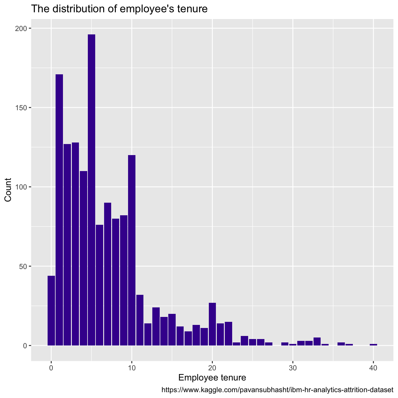
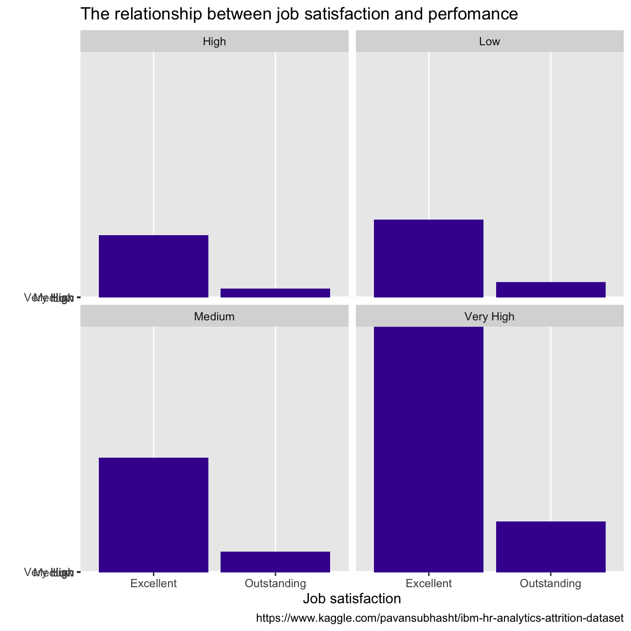
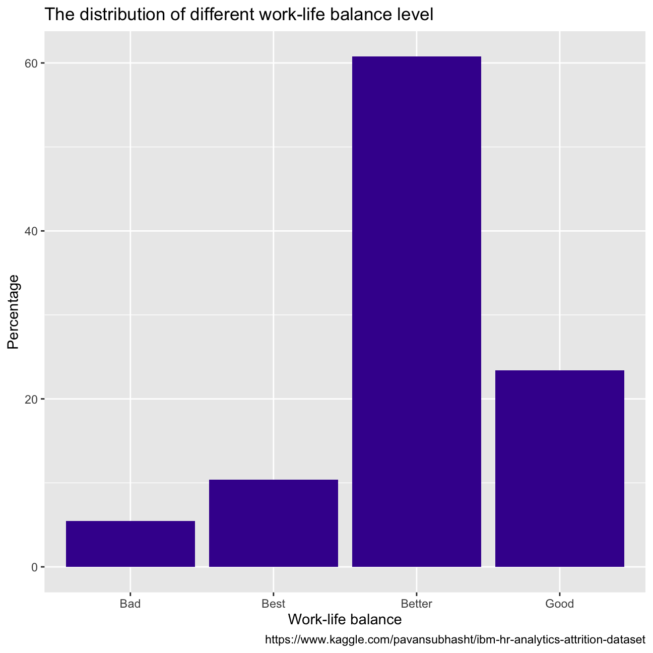
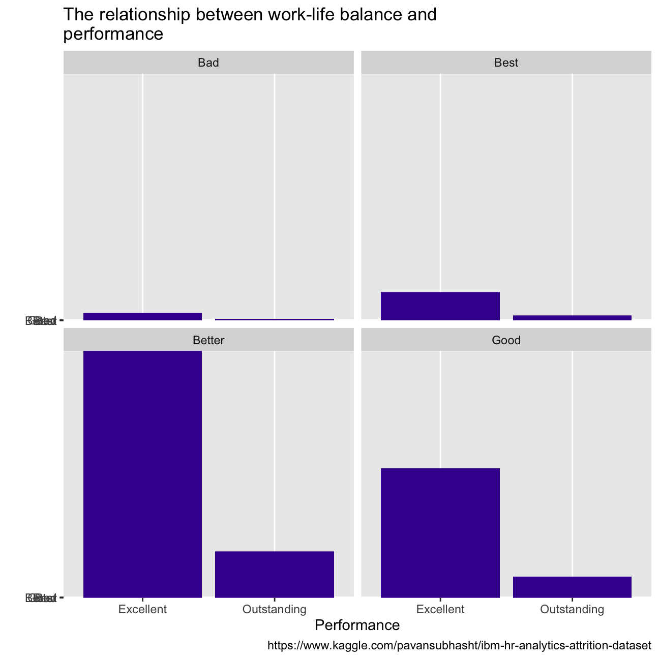
With regards to employees’ wellness, over 60% of them reported high or very high job satisfaction, while most people report a better state of work-life balance. When we look at the performance between groups of employees that report different satisfaction and balance, there does not seem to be a difference in the proportion of employees that score outstanding, or excellent(CHECK PERCENTAGES).
hr_cleaned%>%
  group_by(job_satisfaction)%>%
  summarise(percentage = count(job_satisfaction))%>%
  mutate(percentage = percentage/sum(percentage)*100)%>%
  ggplot(aes(x=job_satisfaction, y = percentage))+
  geom_col(fill="#42069C")+
  labs(title = "The distribution of different job satisfaction level",
       x = "Job satisfaction",
       y = "Percentage",
       caption = "https://www.kaggle.com/pavansubhasht/ibm-hr-analytics-attrition-dataset")


hr_cleaned%>%
  group_by(performance_rating)%>%
  ggplot(aes(x=performance_rating, y=job_satisfaction))+
  geom_col(fill="#42069C")+
  facet_wrap(~job_satisfaction)+
  labs(title = "The relationship between job satisfaction and perfomance",
       x = "Job satisfaction",
       y = "",
       caption = "https://www.kaggle.com/pavansubhasht/ibm-hr-analytics-attrition-dataset")

hr_cleaned%>%
  group_by(work_life_balance)%>%
  summarise(percentage = count(work_life_balance))%>%
  mutate(percentage = percentage/sum(percentage)*100)%>%
  ggplot(aes(x=work_life_balance, y = percentage))+
  geom_col(fill="#42069C")+
  labs(title = "The distribution of different work-life balance level",
       x = "Work-life balance",
       y = "Percentage",
       caption = "https://www.kaggle.com/pavansubhasht/ibm-hr-analytics-attrition-dataset")


hr_cleaned%>%
  group_by(performance_rating)%>%
  ggplot(aes(x=performance_rating, y=work_life_balance))+
  geom_col(fill="#42069C")+
  facet_wrap(~work_life_balance)+
  labs(title = "The relationship between work-life balance and\
performance",
       x = "Performance",
       y = "",
       caption = "https://www.kaggle.com/pavansubhasht/ibm-hr-analytics-attrition-dataset")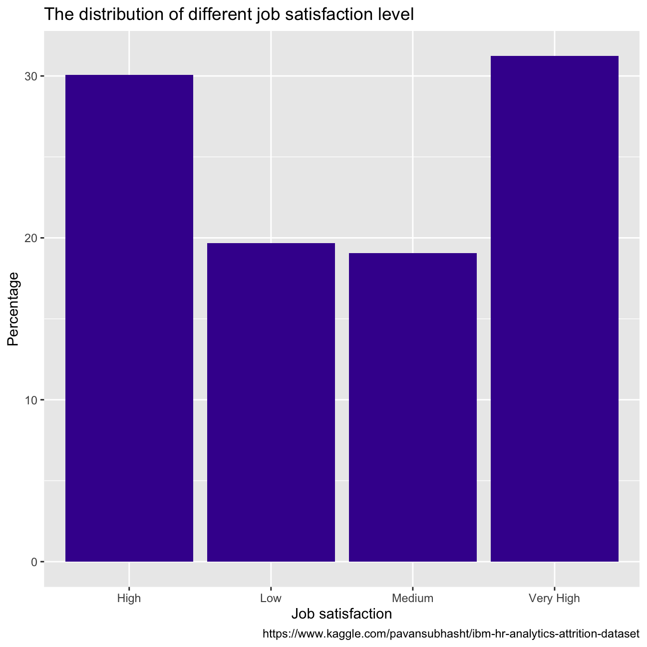
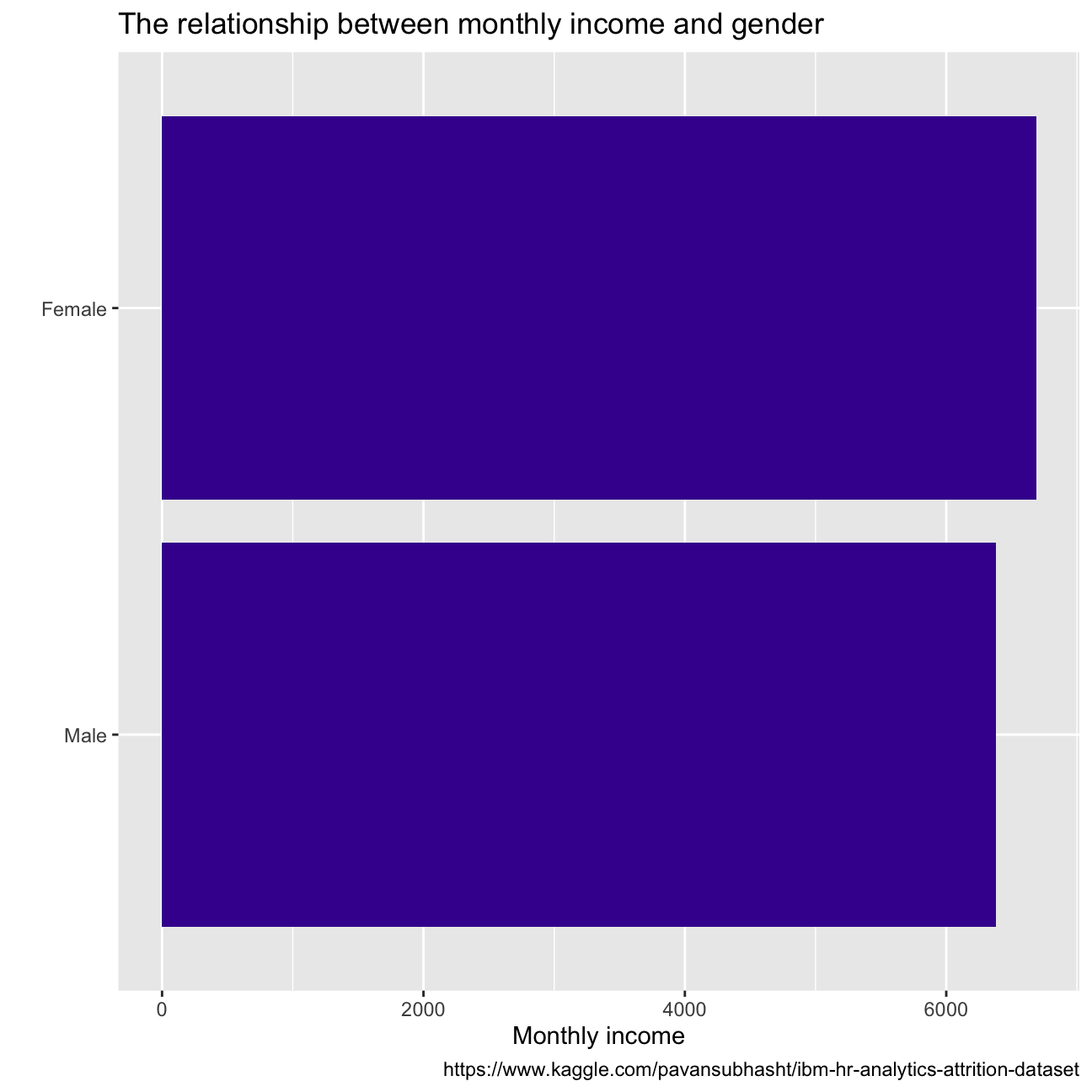
From the plot of gender vs monthly income we see that for women, monthly income is around USD 6500 while for men it stands at USD 6250. So it’s clear that there is some income difference between females and males but it is almost negligible (USD 250). Monthly income varies directly with the education of employees. So employees with a doctorate are generally paid the highest monthly income.
hr_cleaned%>%
  group_by(education)%>%
  summarise(monthly_income=mean(monthly_income))%>%
  ggplot(aes(x=monthly_income, y=fct_reorder(education, monthly_income)))+
  geom_col(fill = "#42069C")  +
  labs(title = "The relationship between monthly income and education",
       x = "Monthly income",
       y = "",
       caption = "https://www.kaggle.com/pavansubhasht/ibm-hr-analytics-attrition-dataset")

hr_cleaned%>%
  group_by(gender)%>%
  summarise(monthly_income=mean(monthly_income))%>%
  ggplot(aes(x=monthly_income, y=fct_reorder(gender, monthly_income)))+
  geom_col(fill = "#42069C")+
  labs(title = "The relationship between monthly income and gender",
       x = "Monthly income",
       y = "",
       caption = "https://www.kaggle.com/pavansubhasht/ibm-hr-analytics-attrition-dataset")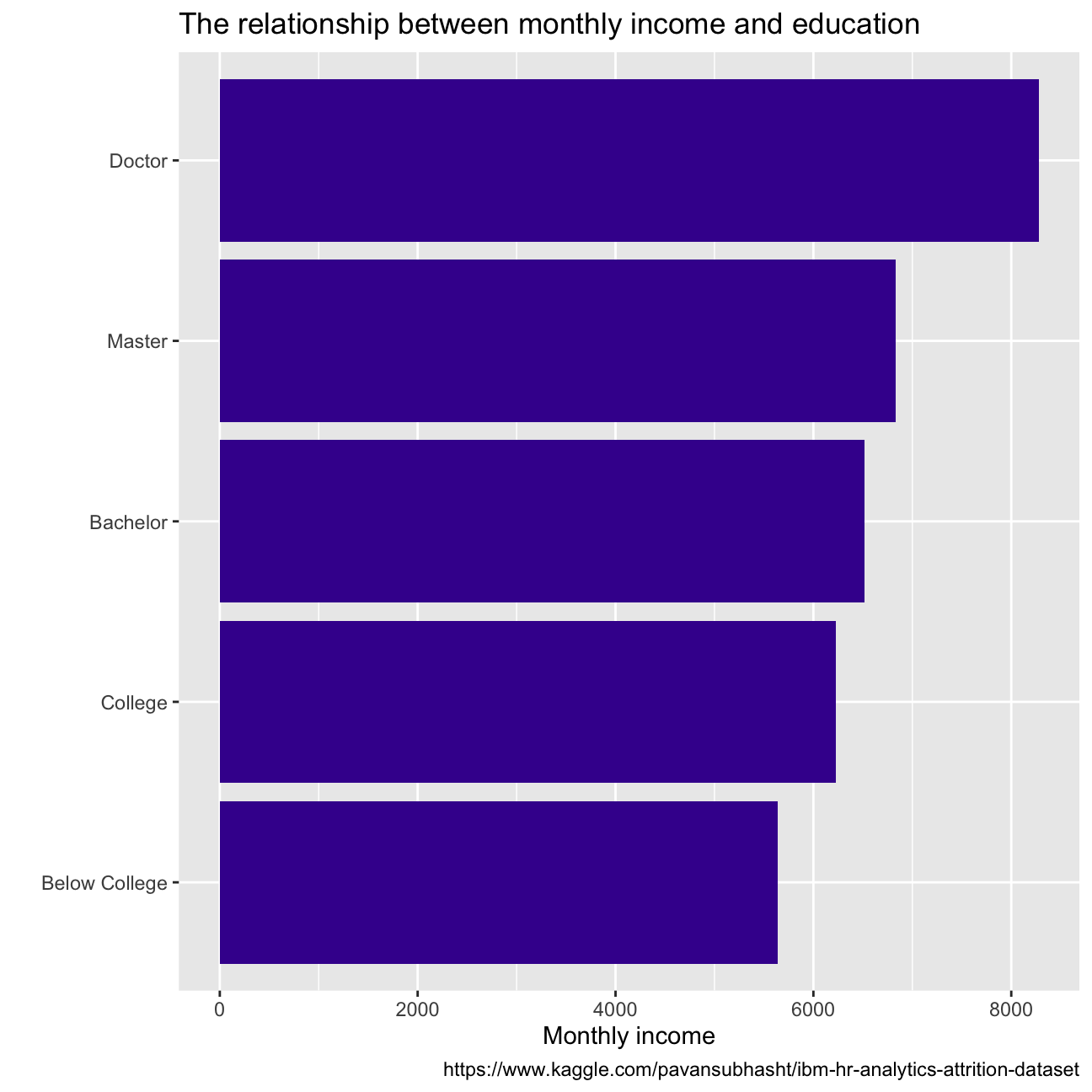
Employees with managerial roles are generally paid higher income, compared to the others, owing to the importance of their roles and the amount of responsibility they hold.
hr_cleaned %>%
arrange(desc(monthly_income))%>%
ggplot(aes(x=monthly_income, y=fct_reorder(job_role, monthly_income)))+
geom_boxplot(color = "#42069C") +
labs(title = "The relationship between monthly income and job\
roles",
x = "Monthly income",
y = "",
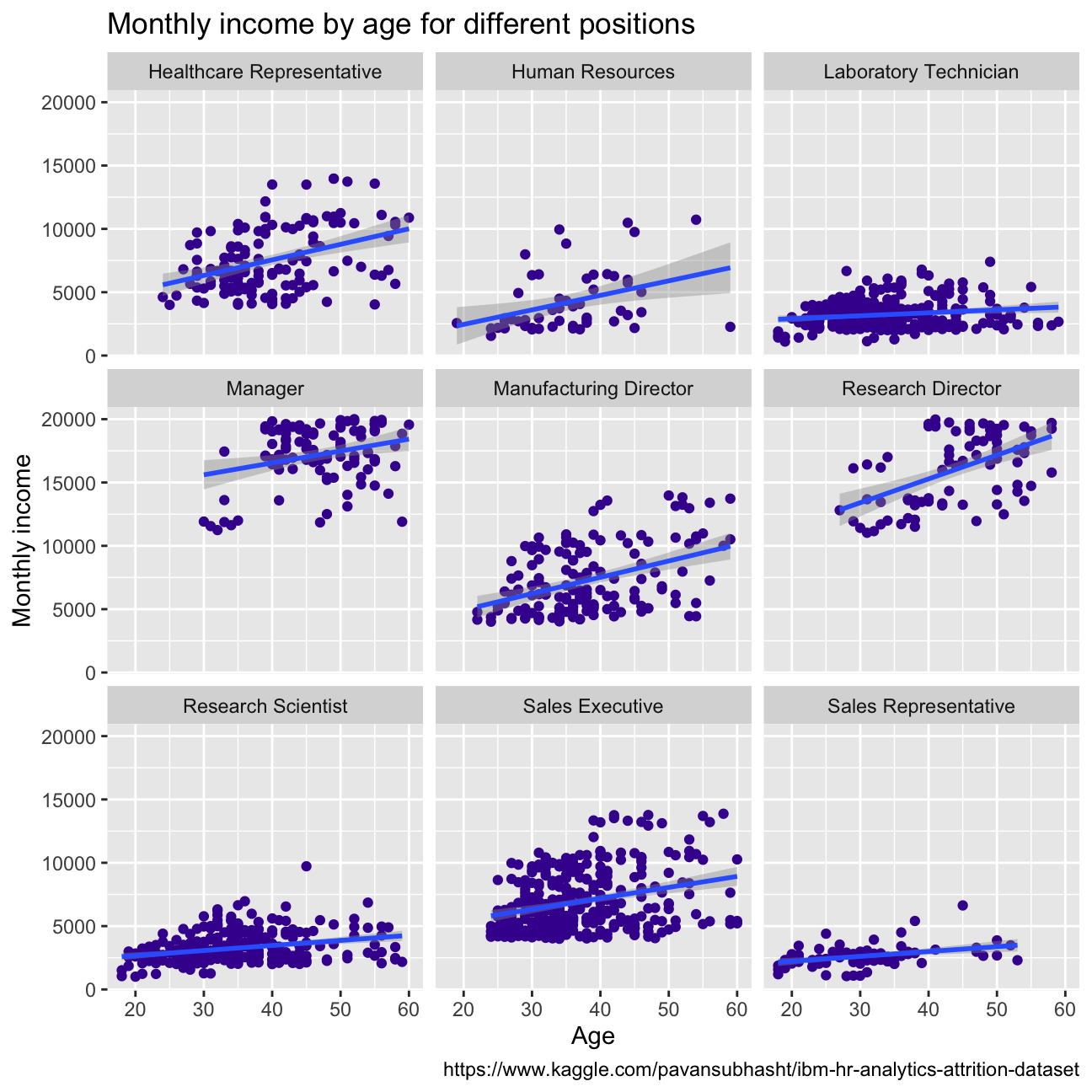
caption = "https://www.kaggle.com/pavansubhasht/ibm-hr-analytics-attrition-dataset")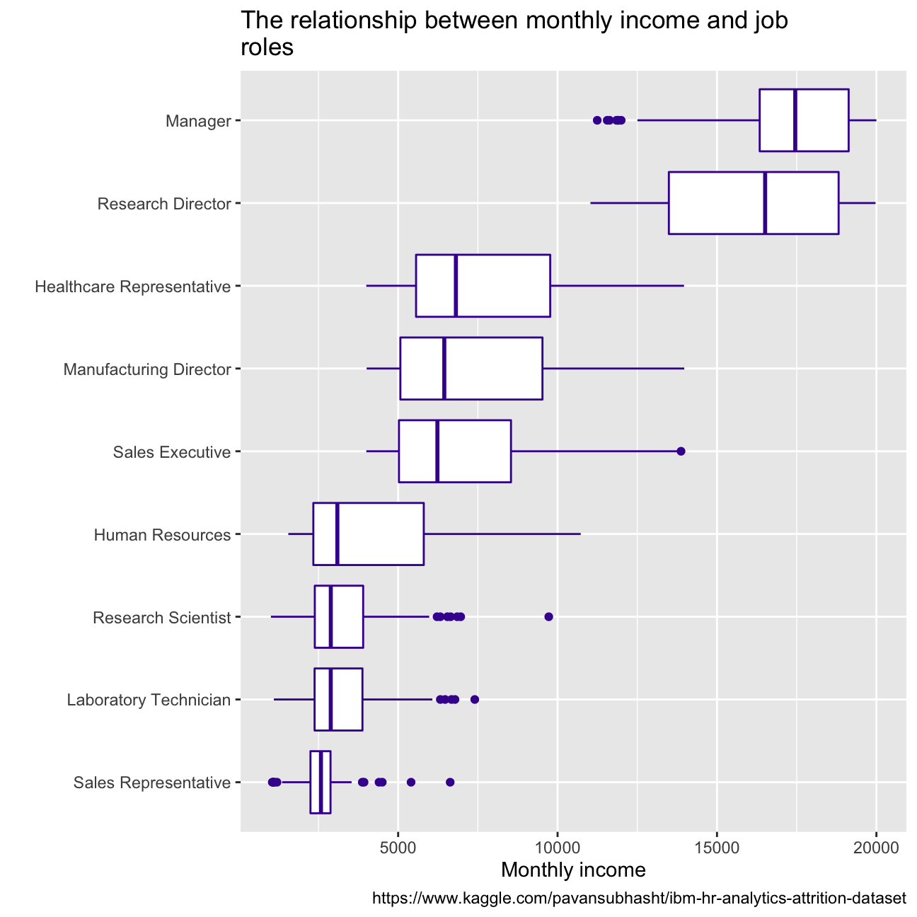 Monthly income generally increases with age, except for the sales representative and laboratory technicians. This could be because, with more experience, the employees can move to the roles with more responsibility which leads to higher monthly income. For sales representatives and Lab technicians, income increase is almost negligible with age. This could be because, for these roles, more work experience doesn’t necessarily guarantee more skills learnt for them to move to better-paying roles.
hr_cleaned %>%
  #arrange(desc(monthly_income))%>%
  ggplot(aes( x= age, y= monthly_income))+ facet_wrap(vars(job_role))+
  geom_point(color="#42069C")+ geom_smooth(method="lm")+
  labs(title = "Monthly income by age for different positions",
       x = "Age",
       y = "Monthly income",
       caption = "https://www.kaggle.com/pavansubhasht/ibm-hr-analytics-attrition-dataset")